Today's Article is brought to you by Emma from Invaluable
Did you ever have one of those cheap mood rings when you were younger? For those of you that didn’t or don’t remember, mood rings supposedly change color based on your mood. In reality, they change color due to temperature, and your body temperature may or may not change with your mood. The magic is gone now that we know mood rings aren’t special mind readers.
While mood may not determine color, color can most certainly dictate feeling.
As early as the 15th century, artists have been using specific pigments to convey and evoke emotion. However, a comprehensive understanding of color theory (rules for use of color in art) wasn’t introduced until the 18th century when Isaac Newton developed the color wheel.
Now, the effects of color have expanded from art to appear in nearly all aspects of a consumer’s life. Companies pick shades that symbolize their brand in effort to better communicate with current and potential customers. Other institutions such as universities also use colors to identify themselves.
Overview of Color Psychology
Color psychology is defined as the “study of hues as a determinant of human behavior.” This means that artists and marketing professionals alike can analyze how different colors make us feel and react. Some color associations are so powerful they can stimulate an action or behavior in addition to a feeling.
 For example, if you don’t like spicy food, you probably won’t buy spaghetti sauce that has a red label. Yes, the sauce is already red, but a red label gives the impression that it’s a spicy version of sauce. You may elect to stick with a trusted brand (blue) or one that reminds you of happy times with your family (yellow).
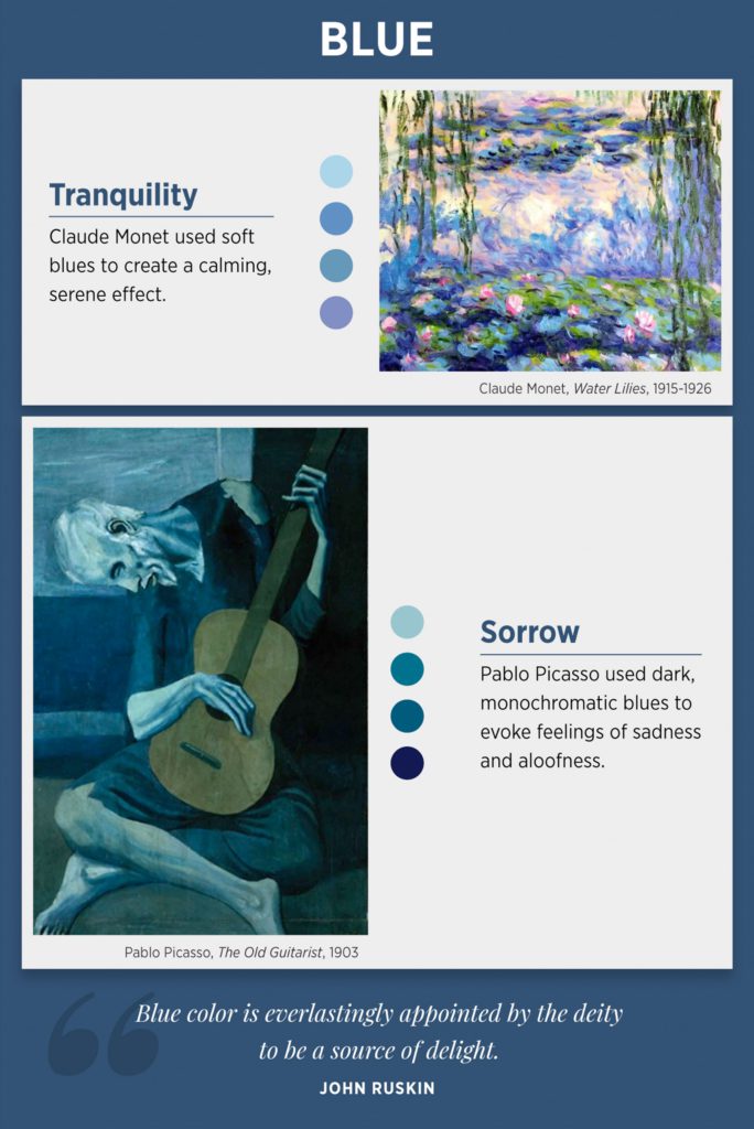
With regard to art, colors are used to portray the artist’s emotions. Furthermore, the artist can intentionally use colors to bring about certain emotions in the audience. Possibly one of the most notable examples of this is Pablo Picasso’s blue and rose periods.
From 1901-1904 Picasso was in his “Blue Period,” in which he painted almost exclusively monochromatic paintings. He used various shades of blue to depict somber and disheartening scenes. Subsequently from 1904-1906, the spanish painter was in what we deem as his “Rose Period.” He implemented cheery shades of red, including orange and pink, as a direct contrast to cool colors from his previous period.
You can see how the meaning of color played a significant role in his works. He translated his feelings into a visual that the viewer could then unpack. The audience had the opportunity to glimpse into Picasso’s mind. What’s more, the viewer may have a different interpretation of the painting that applies to his or her own culture and life experiences. It’s important to remember that colors and design can mean something different for each person who sees them.
Keep scrolling to learn about various color associations in Western cultures. And enjoy the infographics below, that first appeared on Invaluable, to see the science of color as explained by art.
Blue
Blue is seen in a variety of shades throughout nature, most notably the sky and bodies of water. Because of the connection to tranquil nature scenes, blue is often associated with calmness and contentment. Shades of blue also embody trustworthiness, explaining why it is seen in banks and police departments. In some situations, especially in art, dull and dark blues can symbolize sadness.
Green
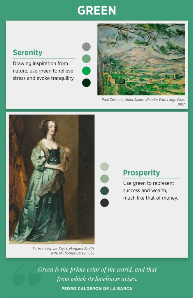
Green is even more closely tied with nature than blue. As lush plants and trees flourish they reflect a multitude of green hues. Likewise, most cultures generally see green as representing youth and health. In America, green is also correlated with prosperity due to the green currency.
Purple
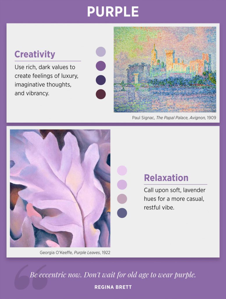
Purple has a long-standing association with royalty. It is a difficult color to produce so historically only the rich could afford purple items. In modern times, purple is viewed as exemplifying creativity and serenity.
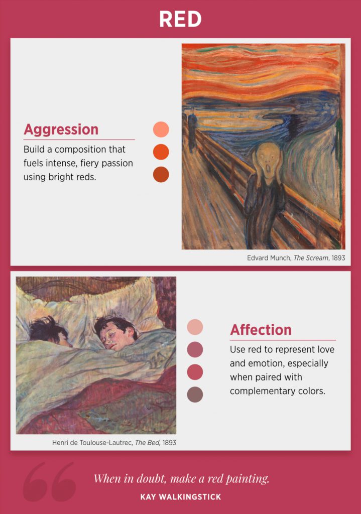
Red
It’s no surprise that a bright, abrasive red can express anger and tumult. However, red means more than just frustration or chaos. It imparts passion, including love. Red is used by many brands not necessarily because of the feelings it evokes, but because it is very easy for the human eye to notice.
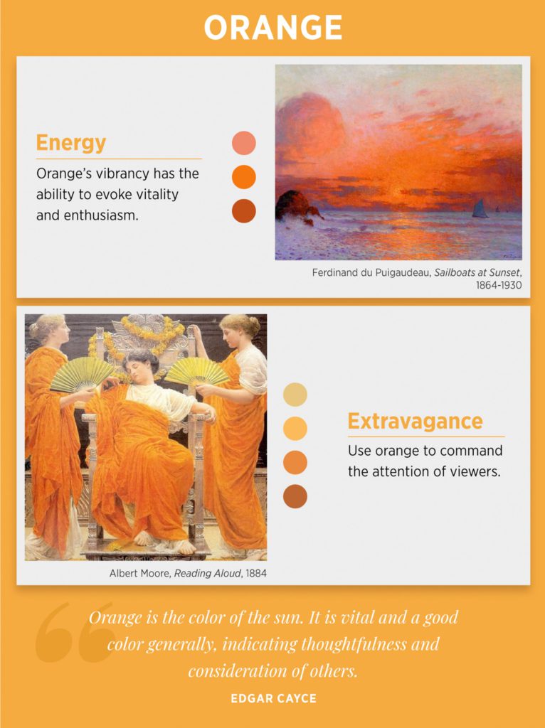
Orange
Orange, like red, is highly visible and often used in branding, especially for sports teams. Bright oranges are energetic and jovial whereas lighter hues can be perceived as soothing and refreshing, such as sunsets and orange sherbet.
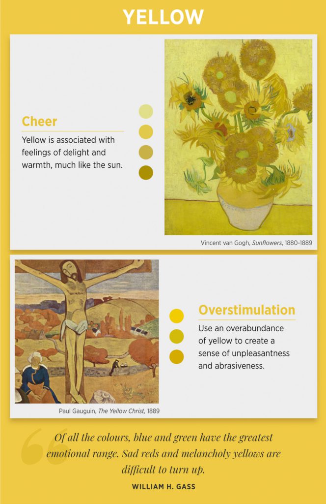
Yellow
In Western cultures yellow is most often identified as cheerful and warm. However, when it’s used too harshly or in the wrong context it can evoke frustration and discomfort. An interesting fact about yellow is that it’s linked to appetite stimulation which is why many food products and restaurants use yellow in their branding.
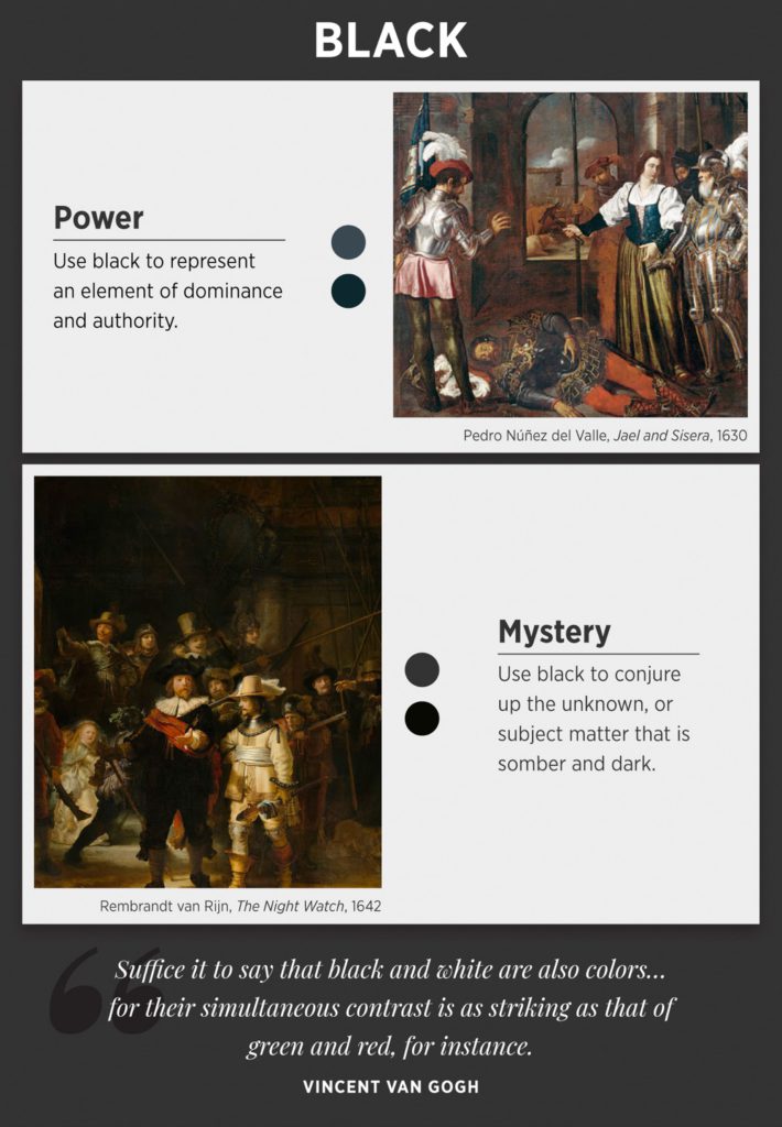
Black
Though black is often related to darkness and evil in popular culture, it holds a deeper meaning. In Western societies, black also holds significant visual weight that denotes power and authority. This is why brands like Apple and Nike use black as their main color.
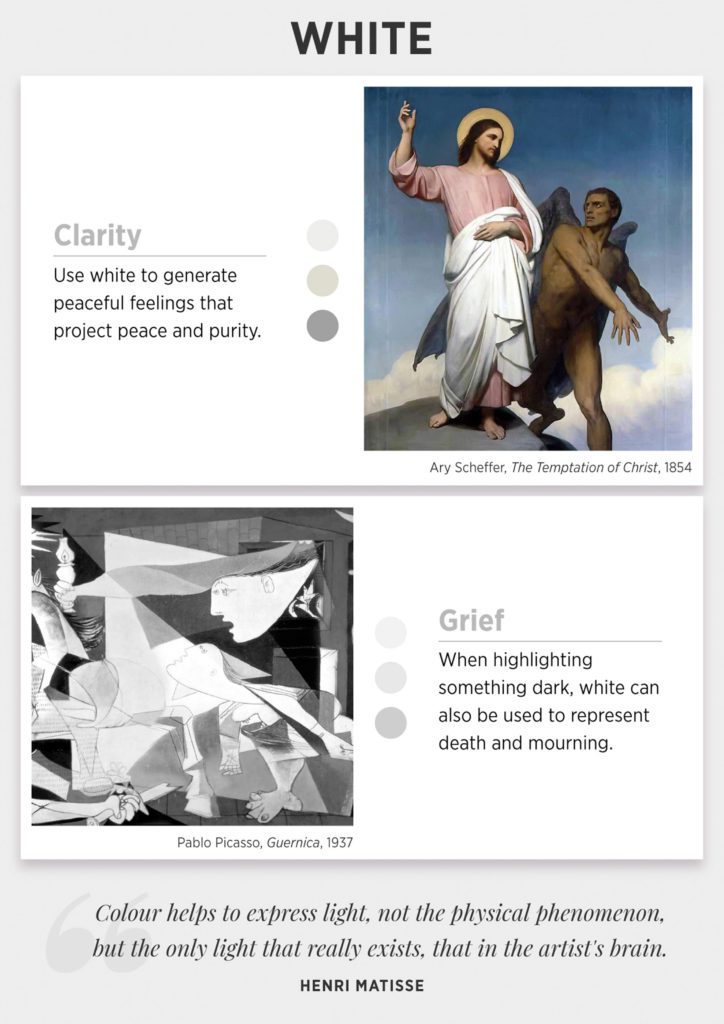
White
White is interesting because it has nearly opposite connotations in Western and Eastern cultures. In the West, white is seen as pure, elegant, and clean. On the contrary, white is associated with death in the East. In some cases, such as prison, the sterility of white can be used to induce sensory deprivation.
Key Takeaway
As you can see there are a variety of emotions exhibited through colors. Moreover, there can be several feelings evoked simply by changing the shade of a single color. For example, black can illustrate stark evil or power, but gray (a mix of black and white) is observed as dull and indefinite — hence the term “gray area.”
Corporations take advantage of the color psychology phenomenon by using colors that are proven to draw attention. Colors are cornerstones in transmitting meaning without the consumer consciously realizing it.
Now that you know how colors affect emotions, begin using them to your advantage!




4 Responses
Thankyou that is very interesting and has given me a good insight into colour and true evoking emotion behind each one.
are those posters for sale?
But, what about Brown?! What does “brown” represents in emotions?!
Thank you for this useful teaching resource 😊💜