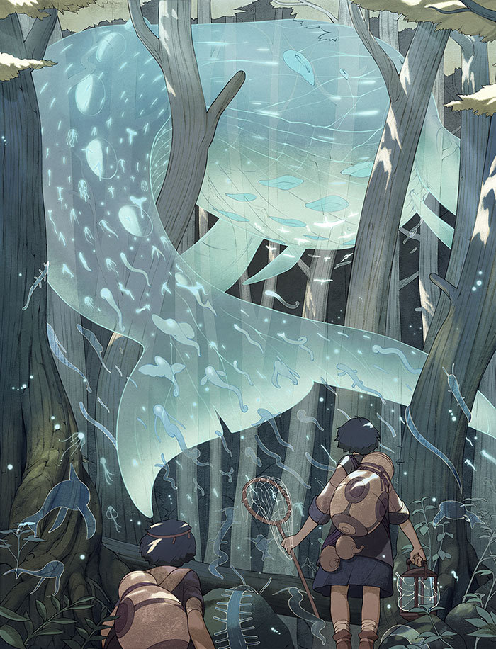
This week we will be looking at Step-by-Step Art Process featuring Kevin Hong! He is a contemporary illustrator based in New York and a graduate of the School of Visual Arts in Manhattan.
You can read more about him in our interview session with him: “Artist Interview #1 – Featuring Kevin Hong”.
Below you will see process GIFs published on Kevin’s Tumblr website: http://k141.tumblr.com/tagged/k141
Kevin Hong’s Art Process
It seems like Kevin’s process goes something like this :
Basic composition and anatomy sketches -> finished linework -> texture -> base colors -> details -> shadows -> more details -> color corrections.
Check them out for yourself – they are very inspiring progress shots!
I’ll mention a few things that I’ve noticed about his process along the way 🙂

A dark but beautiful piece we got here!
Notice how the sword leads your eye to the sword holder, which then takes you to the hand and back to the sword! This thoughtful composition keeps viewers’ eyes moving around the image.
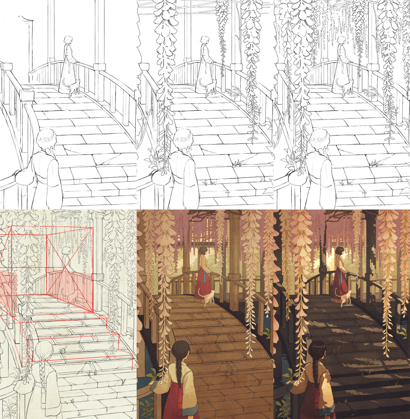
A clever use of perspective rules/guides. Notice the detailed shadows!
Once again, the composition is very thought-through with the foreground character leading your eyes to the middle ground character, following the bridge into the background.
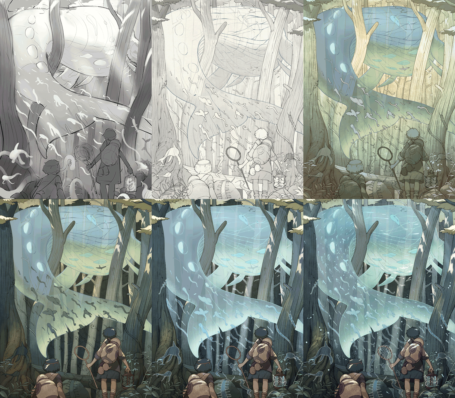
In this artwork, Kevin first figured out the values in black and white – and then put color on top of it. Plenty of lovely details throughout the piece keeping it balanced.
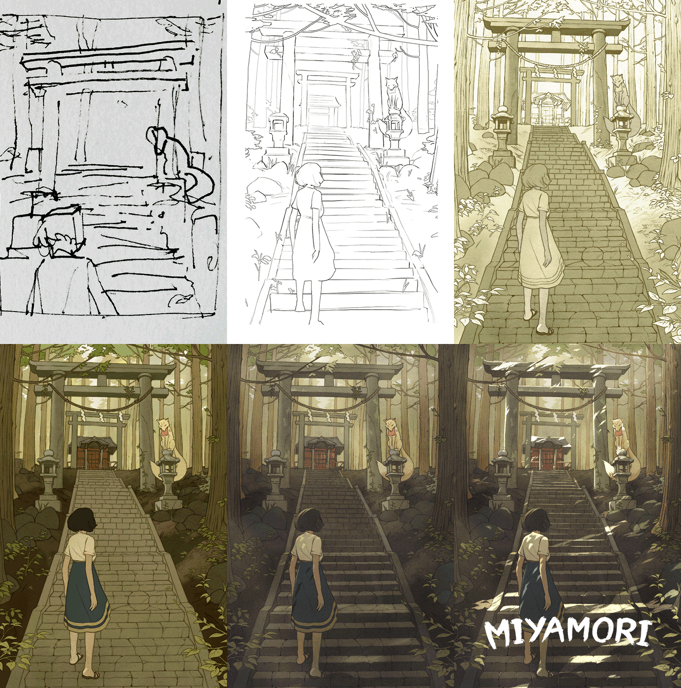
Starting from a basic thumbnail sketch on a piece of paper – to a detailed beautiful finished artwork.
Again, notice the shadows on the stairs created by nature from above. Things like this are what bring the artwork together!
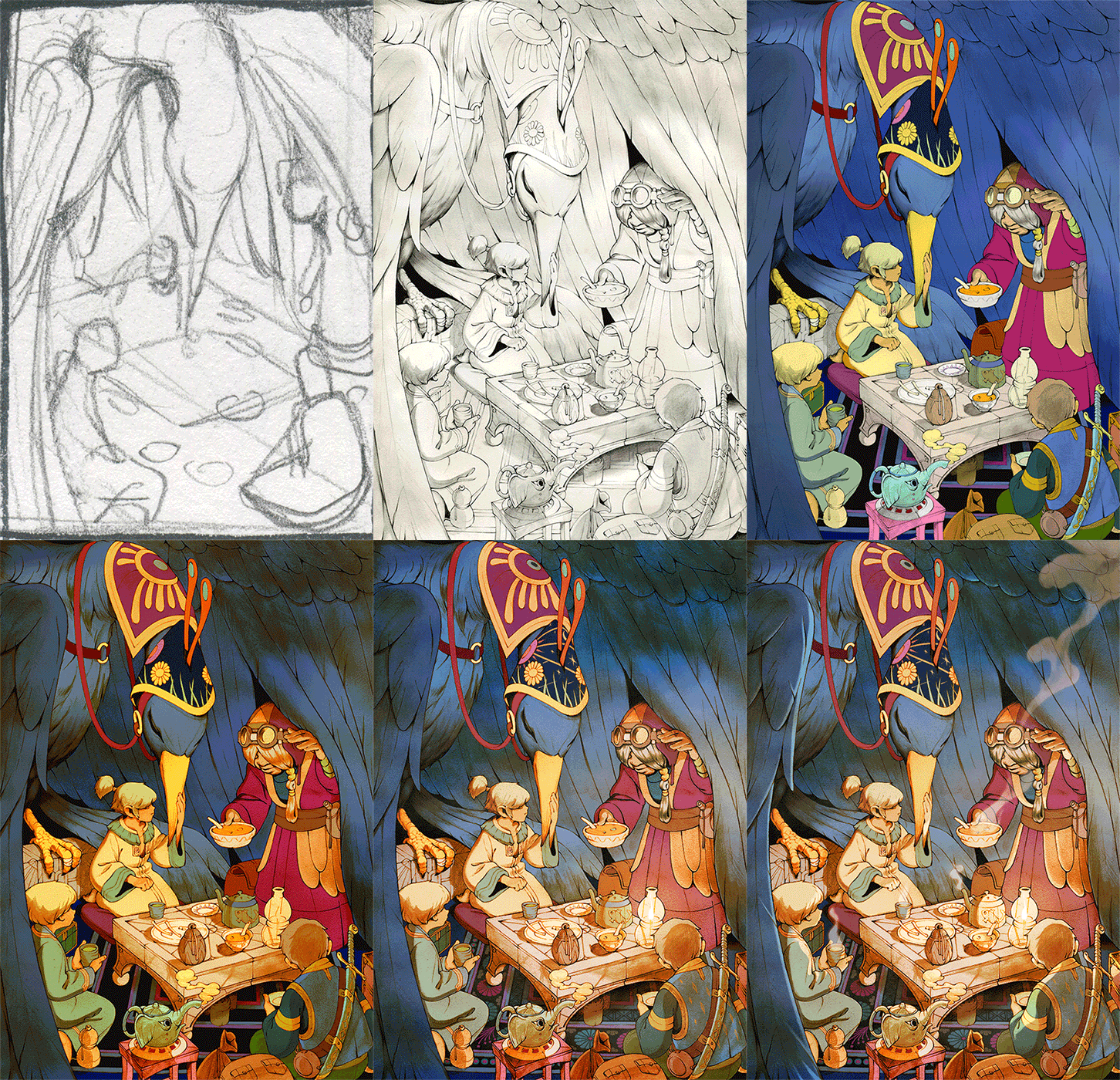
Lighting plays a big role in defining the mood of your piece, and Kevin does that very well by having multiple light sources.
Notice the overlapping elements that create depth within this work, even in such a cramped space.
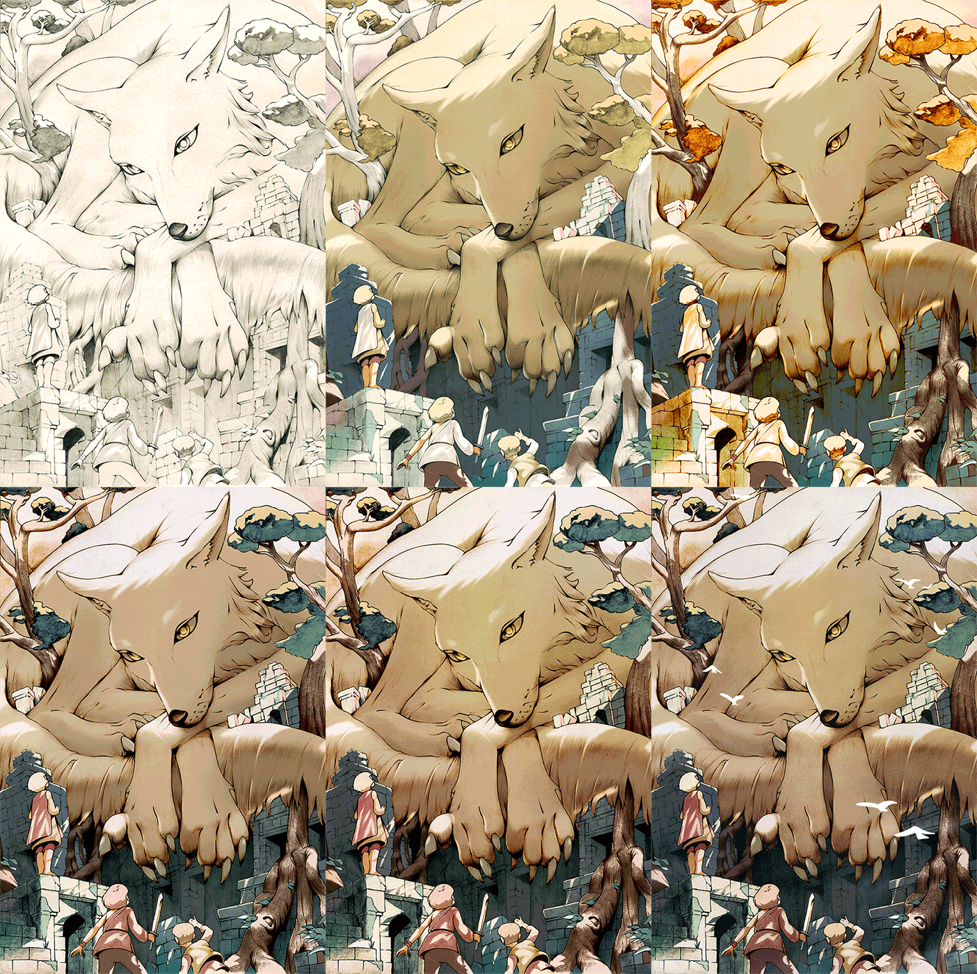
Notice the clever composition in this piece! Kevin Hong is really playing around with size contrast here.
Imagine a horizontal line across this artwork and notice how many subjects are at the bottom vs the top. Also, the viewer’s point of view is looking up from below, which makes the creature above feel that much larger.
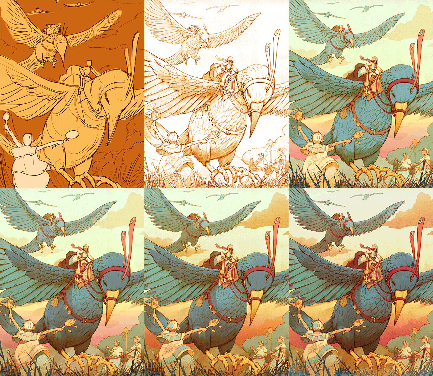
The way the bird’s wings are cut off makes the composition very strong and really takes you inside the scene.
Kevin creates a strong feeling of depth with the grass in the foreground, and the bird’s size getting smaller as they move to the background.
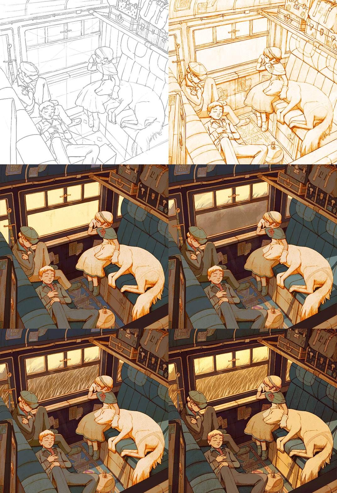
The color of the lines is red instead of the usual black we have seen so far, which adds to the mood of this art piece, as the color shines through the final layers of color.
I really enjoy all the various points of view the artist uses to help tell the story.
*All the comments regarding his process work are based on what I’ve noticed, and not from the artist’s own words.*
That was fun! Did you like looking at the step-by-step art progress shots from Kevin Hong? What strong points did you notice about these pieces?
–
Check out these posts for more Art Tips, Inspiration and Motivation :
* ” How to Art – 7 Beginner Steps to Improve Your Drawings “ for some more tips on how to get started on Your Art Path!
* ” 15 Leonardo Da Vinci Quotes ” to learn from the master’s ideas!
* ” Art Inspiration Weekly #1 ” to get inspired by awesome contemporary artworks.

