Here is my newest video tutorial on digital portrait painting step-by-step in Procreate app.
In it I share a bunch of tips that apply to both digital and traditional artists.
So no matter your favorite supplies, grab a cup of tea and enjoy!
Note: If you prefer reading, scroll below the video! And make sure to share this article if you like it! 🙂
Related:
- Freebies for Procreate Artists
- Mastering Procreate App Video Course
- Procreate Reference Layer Video Tutorial
- How to Paint Portraits in Photoshop
Did You Like the Tutorial? Share it! 🙂

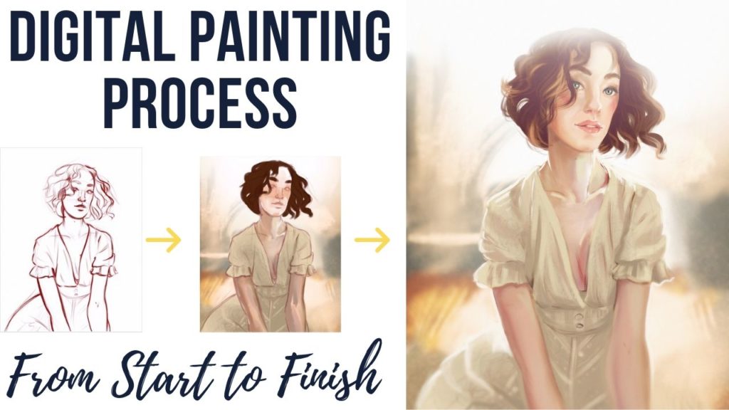
Digital Portrait Painting Tutorial Step-By-Step
Hi guys, and welcome to my digital painting tutorial process video!
Today I’ll be showing you how I went from finding this gorgeous photograph by @Sawyerw on Sktchy app and Instagram to then painting it inside the Procreate app on the iPad Pro.

If you want to get started with procreate and need some help, check out my “Master Procreate App Course” .
Now without further ado, let’s get started.
The Sketch:
I began with a simple sketch starting with lighter strokes and then strengthening them as I feel more confident about the lines I’m putting down.

As you might’ve noticed I chose a brownish reddish color to start, as I love starting with any color rather than black, I find it helps me keep the drawing phase more lose.
I’m not using any grids, lines or anything of the sort just eyeballing as I go, and trying to put the big shapes down first.
One of the biggest issues I see beginner artists face is they focus on a little part of the drawing first trying to get it perfect, but then it’s harder to go back and the big picture.
That’s why I always start with the big bold shapes first and then narrow it down as I go.
As for the hair – try to find the big shapes as well!
As you can see I started with big shapes, then a bunch of smaller ones. And at the end of the painting, I’ll be adding a few strands of hair here and there for a more believable effect.
The Major Colors:
The next step for this painting is laying down the major colors.
Sometimes I would start with the black and white rendering and then add colors on top, but I feel like sometimes it takes away the liveliness of my paintings.
So if you can – go with colors right away!
If you are still learning rendering, saturation and so on, then maybe going with black and white is a great idea at first!
One of the biggest tips I can give you is to lay all of the major colors down right away!
I learned it from my painting professor at my university, and he would always say that all of the major colors need to be on the page before you proceed. It all comes down to how one color affects the other.

Here is an example of the same color squares, and if I add a background after finishing a painting, then the mood will change dramatically depending on the color I choose.
That’s why you should always get the background down as quickly as possible.
For the background in this digital painting, I used a big soft brush and just added some white to represent the light.
Otherwise, the background is painted with some smudged painterly brushes, and the rest of her is done with pretty much one brush only.

As you can see, I constantly jump from place to place trying to keep the same amount of details throughout the painting.
I still haven’t touched the original sketch layer, but I’m of course working on a different layer for other parts of the drawing.
Usually, I try to have at least 4 layers:
- 1 for the sketch,
- 1 for the background,
- 1 for the figure and
- 1 for details.
- But more often it gets past 10 or 20 layers all together.
After I’ve laid out all of the basic colors of this painting, I can now begin slowly getting rid of the sketch layer.
It’s a mix of different things really, I can alpha lock the sketch layer and change the color of it, erase some unneeded parts and paint on top of the other. It’s an intuitive process of adding and subtracting for me, I just try to make it feel right.
The next part of my process is to focus on the most important part of the painting and in this case, it’s her face.
So I play around with different color variations making sure to add some red to her nose, lips and cheeks, while also blocking in the shadows to make her face feel more 3 dimensional.

I constantly rotate the canvas to make the movement of my hands and the strokes I make ore confident and comfortable.
At this stage, the painting looks like a big mess, but it will get better so don’t give up and just keep going!
When I first started with this painting I would use the smudge tool a lot to blend the colors. But I only do it at the beginning, and I don’t actually like using the smudge tool at this point.
The reason is simple – I want my painting to be interesting, sharp and believable.
Using the smudge tool all the time often makes the figure look unrealistic, digital and plastic. To avoid that, we use a mix of hard edges and soft edges through the painting.
I usually leave adding highlights till the end, as it really brings the liveliness to your art, but in this case, I thought it was appropriate to block them in now, as there is a beautiful white light behind her.

I’m also constantly using the “creative license” by changing up the colors a bit, fixing her pose and even with the highlights.
If you think something will make your work look better – add it in!
We are not photographers, we are here to create beautiful art so do your thing!
As you can see, I also flip the canvas a lot, it’s a neat little trick that helps you notice the mistakes you’ve made.
You see, when you stare at something for a while it starts looking right to you, so by flipping canvas, we are tricking our brain into perceiving this as a new image and that’s when we notice and fix those little anatomical mistakes that stand out.
I also use the liquify tool quite a lot, mostly to move around some parts and exaggerate others.
A short side tip: eyes and teeth, more often than not, are NOT a pure white color. They are affected by surroundings, so if the lips are only a bit open, then their shadows and colors will affect the teeth. And the same goes for the eyeball. You see, it’s under the eyelid, so there is a shadow coming from up to, and it’s round, which means that the brightest highly is only at one spot, and then it diffuses.

At some point in this digital painting process, I stopped liking the colors of her body, so I used the levels filter tool on that part and made it redder and more saturated.
Filters were originally created for editing photographs, but artists soon realized how helpful they are during a painting process. So I use a variety of filters throughout the creating process, and often at the end as well.
I usually do it on a duplicate layer, however, so I can see if the difference I made is worth it, if It’s too much and I should lower the opacity or if it’s no good at all and then I will delete it without worrying about my actual work.
For the hair, I used my hairbrushes that I’m giving out for you guys for free, and you can grab your copy HERE. I use the brush at first, then blend the ends to make it look more believable.
At some point I also figured that this painting needed more shadows, so I added them on a new layer, played around with layer modes to see what works best and then lowered the opacity.
In the final stages of your painting process you should ask yourself not only what else can I add, but what should I take away?
Overloading your image isn’t going to make it more effective, your viewer’s eyes need a place to focus on and place where they can rest. Having a balanced mix of both is what we are going for.
I then decided to add a new white soft layer on top of the work and blend it via screen more, because on the reference image we have some light completely covering the top of her head, so I am sort of going for that look here as well.
I then tried to recreate the rainbow reflection we see on the image, but ended up not really using it as I thought it takes away the attention from the main subject too much. So I made it almost invisible, but still kept it at the background for added interest.
Adding some extreme highlight to her face at the final stages really allowed it to pop and capture interest, sure, they don’t exist in the reference, but that’s the beauty of digital art – you are in control of the final result. Just don’t overdo it!

I also like making pupils not completely black, but then adding a line of pitch black around the highlight for maximum contrast.
In the end, I duplicated all of the layers and combined them together because now I want to add some lens blur to the work. So I blurted the entire layer and then using the mask tool masked out the parts I want to keep sharp.
Then, I added a bit of noise to make the image look less digital.
And finally, played around in color correction to see if I can make it pop even more. Then added some contrast and signed my name.
And here is the result!
I hope you found this tutorial helpful!
Save some of my process images to your art-related Pinterest boards for future reference and inspiration!