What does emphasis mean in art? Let’s break it down by looking at the visual emphasis in art definition, examples of emphasis principle in master artworks, and the 5 types of emphasis artists use.
In visual art, it’s important to draw attention and the viewer’s eye to the main focal point or message of your artwork. Emphasis is one of the tools we can use to accomplish that.
Let’s dive in.
Emphasis in Arts: Definition and Meaning
Emphasis in visual art refers to the principle of highlighting certain areas or elements within the composition to create a sense of importance and a focal point. Its purpose is to draw viewers attention to that specific element or area.
Emphasis can be achieved through several techniques, such as contrast, color, scale, placement, and repetition.
An artist will create emphasis to draw your eyes to a specific spot. This exact spot can be a person, an inanimate object, or simply a line, figure, or a shapeless blob. It doesn’t really matter.
This area of emphasis is called the focal point of the artwork.
A focal point in art is a specific area or element within a composition that stands out as the primary point of interest or importance.
There can be more than one area drawing attention. However, in most cases, one is dominant over all others. Having two or more may cause confusion and lead to misinterpretation of the work.
Also, technically there can only be ONE most important thing, right?
However, in some cases, like abstract painting or pop art, the lack of emphasis (or putting equal emphasis on many things) can be a tool of expression in itself.

But where there’s dominance, there’s subordination – the secondary points of the work, also known as the accent elements. They can be de-emphasized on purpose to create direct attention to the focal point(s).
The more evident the specific point is, the faster it will be noticed. So these levels between focal elements and accent elements directly influence the perception of the entire artwork.
In short, emphasis is quite relative.
In order for it to exist, there must be other secondary visual elements that make it stand out in contrast. Elements within an artwork don’t exist separately from one another; everything is connected.
Why is using emphasis in art important?
Emphasis in art is important because it’s a tool that allows an artist to guide the viewer’s attention to the main focus of the image. Without emphasis, a work of art may come off as uninteresting or overwhelming, with no clear path for exploring it.
7 Principles of Art
Emphasis is one of the principles of art, not elements of art. You can learn about each principle of art and element of art in the linked articles below:
- Balance
- Contrast and Emphasis (we are reading about emphasis now!)
- Movement and Rhythm
- Unity and Variety
- Harmony
- Pattern
- Proportions and Scale
The 7 Elements of Art
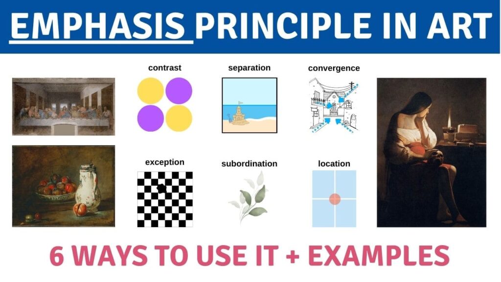
6 Ways: How to Use Emphasis in Art
An artist can create emphasis in art through one of several ways: contrast, convergence, separation or isolation, exception, subordination and location.
Artists constantly use one or multiple of them in a single artwork.
1. Contrast
Contrast emphasis is one of the ways to create a focal point in an art piece. It is most commonly done with color, value, texture and line. However, most other elements can be strategically placed within a composition to achieve a similar effect.
One of the most common and easiest-to-spot tools that creates emphasis through contrast is color.
For example, using complementary colors in a painting, like purple and yellow, immediately gives a sense of distinction. Complementary colors are as far from each other on the color wheel as possible, which makes them the highest contrasting colors.
- Related: check out the 20 Best Color Theory Books and Companion Tools for Artists.
Or, using isolated color – when one color is found only once throughout the whole piece. Because it doesn’t match the rest of the image, it will immediately stand out.
Another trick artists can use is absent color – where one object within an image is in color, while the rest of it is monochrome, or vice versa.

Value creates emphasis by placing either lighter values or muted tones in the “strategically important” places. A spot of a brightly lit primary subject, or one in shade, can quickly become the focal point if positioned strategically.
Learn to create emphasis with highlights in this class.
Texture can be used to create contrast if only the most important subject is textured, not textured, or textured in a different way in comparison to the rest of the image.
The line is an effective way to create emphasis by changing the line weight on a certain point. An artist can do it by making lines less or more visually heavy or changing the techniques in which they apply it.

2. Separation/Isolation
Separation or isolation emphasis in art refers to placing the main subject separate from all other subjects. Surrounding the main subject with negative space only maximizes its importance.
The cluster of secondary subjects won’t seem as important or interesting to the human brain as the particular subject that stands out.

3. Creation of Exception/ The Unusual
Creation of exception emphasis in art means making an unusual choice for the focal point that isn’t following any stylistic rules or makes no sense to our accepted ideas.
For example, placing one blob shape instead of one rectangle on a chess board or drawing a cow on the moon. One of them doesn’t follow a set of rules on what shapes are used within an image; the other is an unusual idea that our brains find unexpected.
Creating an exception or something unusual is definitely one of the most fun ways for creating emphasis.

4. Convergence
Convergence emphasis in art is using literal or implied lines to draw attention to the focal point. Lines, shapes, edges and object positions have the power to create convergence.
Convergence can create emphasis in multiple ways. For example, using the linear perspective to draw eyes to the vanishing point; turning the subject’s head will make us follow in that direction as well; using lighter values as a guide, and so on.
Implied lines (click to learn about them) are a subtle but effective tool for this type of visual emphasis.

5. Subordination
Subordination emphasis in art implies de-emphasizing the entirety of an image except for its focal point. Subordination can be created using all visual elements of art, with the most common being color, value, texture and space.
A great example of using color and value as tools for subordination are isolated color and absent color, as we discussed in the color section. Also, simply adding lighter values and more saturation to the main subject in composition to the rest of the image.
Rendering or detailing is commonly seen as a tool for creating emphasis in paintings (I always use it myself). The idea is to add more details or a higher level of rendering to the main subject in comparison to the rest of the painting.
Space draws attention by having little negative space around the focal point, and plenty around it.

6. Location
Location emphasis in art indicates the position of subjects within the canvas. Artists use compositional rules to dictate where the main subjects belong; for example, the rule of thirds, the golden mean or simply at the center of the page.
Most harmonious focal points are usually near the center of the composition but not directly in the center.
Placing the object of art emphasis in the center very much de-emphasizes everything surrounding it. This can make viewers only pay attention to the center and disregard everything else. Knowing this rule, you can use it or avoid it with purpose.

Examples of Emphasis in Art
Let’s look at some emphasis examples in works by master artists.

The Last Supper, Leonardo da Vinci (1494-1499).
- Location – placing the figure of Jesus in the center of the overall composition.
- Convergence – hands and bodies of the apostles, perspective lines.
- Contrast – light value and shapes of the windows behind Jesus.
- Separation – His figure has more negative space around it than all the others.

Magdalene with the Smoking Flame by Georges de La Tour.
- Contrast – the light value of the lit candle and how it affects the front of her figure; brigh red clothing.
- Location – her face is placed on the converging lines of the rule of thirds.
- The unusual – the skull placed on her lap.
- Isolation – her figure and the candle are surrounded by negative space.
- Subordination – the value of lit subjects vs those in the dark.
- Convergence – her gaze and the position of the skull lead our eyes to the candle and its light back to her and the skull.

A Bowl of Plums, painted by Jean-Baptiste Simeon Chardin in 1728
- Contrast – the jug and bowl of fruit have more saturation, contrast, bright colors, light, and a different rendering style than the rest of the image.
- Location – jug placed on the rule of thirds.
- Isolation – the jug and bowl of fruit, plus the small fruit on the left, are surrounded by negative space.
- Subordination – lower value background in comparison to main subjects.
- Isolation – main still life subjects are isolated in an empty space.
How to get started with emphasis in your own artwork?
After looking at the visual examples created by other people, it’s usually easier to understand the concept of something. So now that you know more about what emphasis is and how it can look, time to learn how to do that yourself!
1) Choose an idea for the artwork.
What specific concept do you want to explore, and what emotion do you want to convey with your art? What do you want to emphasize? You’ll have to draw attention only to the important parts of your work, so to decide on that, try to strip down the entire concept to just one simple sentence.
2) Decide what will be your focal point(s).
Which of the five ways we discussed will be best at creating a main point in your work? Can you use multiple to convey emotion of your choosing? Sketch out your idea and create multiple variations of it. Pick the one you think works best (you can always tweak it as you go).
3) Create!
Emphasis Principle Summary
Emphasis in art occurs when dominance is given to a single important element of the artwork. It’s also the process of drawing the viewer’s eyes to specific focal points in order for them to understand the work better.
There is more than one technique available to emphasize the most important element in an artwork: contrast, convergence, separation or isolation, exception, subordination and location. An artist can use these methods separately or several at the same time.
Emphasis Infographic


One Response
your writings are very helpful for the beginner student. Congratulations .