In this article, you will learn what is balance in art and how to spot it. We’ll discuss the four types of balance in visual art and take a look at some examples. After that, we will cover some advice on creating balance in your artwork and using it as a helpful tool.
In three dimensions, balance is dictated by gravity. However, in two-dimensional visual art (like drawings and paintings), you must rely on the visual weight of all the art elements to find balance.
The different elements that make up the image don’t have actual physical mass, but each of them has its own visual weight, making them feel lighter or heavier than the others. The artist can then influence that visual weight.
What is balance in visual art?
Balance in visual art is one of the seven basic principles of design. It refers to arranging the different art elements like lines, shapes, colors, texture, and values to give the artwork a balanced look.
To achieve this, artists create work using different techniques like working with positive and negative spaces, repeating certain art elements, or using different colors and textures.
Ultimately, creating balance in art helps to make the artwork look more attractive to the viewer.
 1")
The principles of art aren’t the same as the different elements of art: the elements assemble the artwork in general, and the principles determine how these elements are arranged.
Essentially, principles, including balance, create and influence the visual compositions of artworks.
The 7 Principles of Art are:
- Balance (we are reading about it now!)
- Contrast and Emphasis (learn about the emphasis principle)
- Movement and Rhythm
- Unity and Variety (learn about variety here)
- Harmony
- Pattern
- Proportions and Scale
The 7 Elements of Art are:
Each art element and principle plays a significant role in the creation of fascinating and complex artworks.
 2")
Balance helps tie the visual elements of art in a way that creates visual stability (or instability) in the artwork’s composition.
But unlike real life, in art, the objects and compositions don’t always need to have complete equilibrium. The presence or lack of it can be a great tool for storytelling and conveying emotions.
Learn how to draw balanced poses in this video.
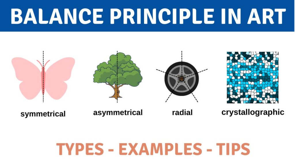
The 3 types of balance in art
There are three main types of balance in art: symmetrical balance, asymmetrical balance, and radial balance.
Symmetrical and radial balance are also formal types of balance due to their strictness and predictability. Asymmetrical balance is considered to be the informal type and is usually thought of as less organized and more spontaneous.
 3")
Sometimes there’s a fourth type of balance mentioned – crystallographic balance or mosaic balance (think of abstract paintings made with paint dripping). It means that equal weight is given to many art elements at once, but they aren’t in a perfectly symmetrical pattern.
It’s a kind of balanced chaos, where all the elements form something that feels harmonious, whole, and completed due to the lack of a single focal point.
Crystallographic balance finds harmony in repetition, so it’s sometimes called an all-over balance.
Symmetrical Balance
Symmetrical balance is when each half of the artwork is identical or similar to the other (also called “mirrored”). In it, the weight of the entire composition is evenly distributed around a central point. Symmetrical balance can be used to create a feeling of order, stability, calmness and serenity within the art composition.
It is a type of balance that looks organized and structured. Symmetrical balance is often seen in nature (ex: butterfly, flower) , as well as in geometrical forms (ex: square, triangle, circle,etc.)
 4")
Visual weight in symmetrical balance is linked to the artwork’s axis, which is usually vertical or horizontal – this is called bilateral symmetry. In the first case, visual elements on two sides of the artwork mirror each other; in the second case – from top to bottom. Biaxial symmetry means there are both vertical and horizontal axes present in the artwork.
The axis can also be diagonal or placed in another way that still makes the parts of the art equal. And when perfect symmetry is unachievable, approximate symmetry works just as great.
Approximate symmetry adds some variety, which means the art elements on either side of the horizontal or vertical axis are similar but not completely mirror images. For example, if we draw an imaginary line across the center of the human body we will see slight variations on either side, though it still feels symmetrical.
 5")
To learn about the seven types of symmetry, visit the linked article.
Radial Balance
Radial balance is when the elements of the artwork are arranged in a circular pattern around a central point. It’s essentially symmetry in several directions at once – think of a cartwheel, flowers, or geometrical star shapes. Radial balance can be used to create a feeling of order and harmony.
This type of balance usually looks very organized and symmetrical and is often seen in nature, for example, in a spider web or a daisy flower.
 6")
This kind of balance can be noticed in still-life paintings and is also widely used in religious designs and contemporary art. Radial balance is meant to draw the viewer’s eye toward the focal point while making a soothing, almost hypnotizing balanced layout around it in the entire art composition.
Radially balanced compositions are quite often circular. Mandalas are a great example of such balance, and you can learn about mandalas here.
Asymmetrical Balance
Asymmetrical balance is when the elements on either side of the art differ, and the entire artwork is not evenly distributed around a central point. It is often seen in nature, for example, in a tree or a mountain range, and can be used to create a feeling of vibrancy and movement.
It is a type of balance that looks less organized, more spontaneous and is not a mirror image.
 7")
At first sight, it may seem like a lack of balance at all, but unlike it, asymmetrical balance retains good composition. This is because even though they are different elements, yet they still feel equally weighted when positioned properly.
Positive and negative space is unevenly located on the artwork, effectively leading the viewer’s eyes between them and through the art composition.
Compared to symmetrical balance and radial balance, asymmetrical one creates way more dynamic and refreshing pictures with more imaginative freedom. It can keep the eyes engaged due to the absence of symmetry and still succeed in achieving balance.
Like with physical scales, you can balance very different objects by moving them around and/or adding more art elements near them (the distance of the objects also matters a lot).
Asymmetrical balance is considered to be more realistic than symmetrical balance. It requires more planning during the artwork creation and often doesn’t just happen by accident.
Why is balance important in art?
As a general rule, balance in art is important because it creates a harmonious and aesthetically pleasing work of art. Using symmetrical, asymmetrical and radial balance can evoke different emotions and feelings from the viewers. It also helps to create a sense of stability in a composition.
Imagine a perfectly balanced scale with objects on either side. This type of balance can be achieved in the two-dimensional space of your artwork by strategically using the three types of balance and arranging art elements accordingly.
Balance is also a tool you can use to direct the viewer’s attention to a specific part of the image or to take them on a journey throughout it. For example, a large object in the middle of a painting immediately stands out and attracts focus. Or, multiple objects scattered throughout in a balanced way make the viewer look around and discover all of them one by one.
 8")
You can even use the principle of balance to evoke a certain feeling or vibe. For example, symmetrical compositions can feel stable, orderly, and calm. On the other hand, asymmetrical balance communicates a sense of movement, instability, tension or drama.
By understanding and using the art balance principle, you can create truly meaningful and memorable works of art.
Examples of balance in art
The best way to learn more about something in visual art is to look! So let’s take a peek at some artworks by the master artists of the past and determine the kind of visual balance present in these works.
 9")
Adoration of the Trinity by Albrecht Dürer (1511) is a notable example of (approximate) symmetrical balance. The two parts of the painting that is separated by the implied vertical balance axis aren’t exactly the same, but they look very much like one another.
The art composition directs the viewer’s eyes towards the figures of Jesus and God, and other figures are symmetrically located to look like they’re surrounding him. Another notable figure is the dove at the very top of the painting, also located on the vertical axis. The central line of the cross also helps us visualize the central line of the entire artwork.
 10")
Charger of Charles II in the Boscobel Oak by Unknown, created around 1685, shows radial art balance in an artwork located on a circular piece of earthenware. The repetitive elements create a pattern that is radially symmetrical and arranged around the center of the dish.
You can easily imagine the many axes that go throughout the circle and mirror the parts of the patterns. All the different elements are repeated, from the king’s portrait to the decorative floral ornaments.
 11")
Vajrahumkara Mandala by Anonymous, created in the 1300s, is a classic example of radial balance. Despite not being circular as a whole, the mandala still has a clearly visible radial symmetry in it, where many repeating elements radiate from its center.
Religious designs in many cultures are often circular, like the central part of this mandala, and have radial balance. That happened because, in numerous religions, a circle is a part of many sacred symbols and symbolizes something itself – like the circle of life or a halo.
 12")
Still Life with Silver Jug by Willem Kalf (around 1655) shows asymmetrical balance. The objects in this still-life painting are balanced in quite an intricate way, with color, light, texture, and size.
The larger and darker objects on the background – a jug and a vase – are balanced by the bright and colorful, but smaller and less textured, fruit in the foreground. The fruit is also located closer to the viewer, which gives them a little more visual weight over the seemingly heavy tableware. The viewer’s eyes slide across the whole painting and notice the different art elements used in depicting each object, from the textures to the play of light.
 13")
Aurora abducting Cephalus by Peter Paul Rubens (around 1636) shows us another example of asymmetrical balance. The right side of the painting is darker and visually heavier; however, the left side is structured in such a way that balances it out by having more figures and details on it. Aurora’s clothing, as well as the figures of two horses, add more visual weight to the left side of the painting.
When the viewer looks at this artwork, they will pay attention to both sides due to them being in balance. Both human figures feel equally important, and all art elements of the painting have enough visual interest to attract attention without being overlooked.
 14")
Flowers in a Wooden Vessel by Jan Brueghel the Elder (around 1606) can be considered an example of crystallographic balance. All flowers are equally bright and detailed, and each of them has equal, or almost equal, visual weight. It’s hard to determine if there’s a focal point in this painting at all, yet the composition feels complete and full.
It is also true that an (approximate) symmetrical balance is present by visually dividing the artwork into left and right sides. Across the central axis, we can see how the vase and the flowers are positioned directly in the middle of this painting.
How to get started with balance in your own work?
Now that you’ve learned more about the examples of visual balance in master artists’ works, you can try to achieve balance in your own creations.
1) You’ll need to determine what kind of dynamic you want your work to convey. Would it be something stable and rational or irrational and dynamic?
2) Try making small thumbnails or sketches before creating the entire work. This way, you’ll be able to try many options and figure out the final look that fits your idea the best. Plan in such a way that you guide the eye movement of the viewer.
Determining the visual weight of the different elements is mostly intuitive, but here are some examples of the visual components you can use:
- thicker lines are considered heavier than thin lines,
- warm colors have more weight than cooler ones,
- more saturation or texture equals more weight,
- simpler and smaller shapes are lighter than larger shapes and more complex shapes
- giving equal weight to objects can be attempted by using contrasting features, such as lighter elements with thicker lines and larger elements with thin lines.
3) Create! If you need to sketch an axis to create balance – do it lightly with a water-soluble or easily erasable soft material, or use washi tape that is very easy to peel off.
Key Takeaways
 15")
 16")
In artwork, balance refers to the principle of art that creates visual stability in the artwork. Each element of the artwork contains more visual weight or less visual weight, and they require some kind of balance for the art to look pleasant.
There are three main types of balance:
– Symmetrical balance;
– Radial balance;
– Asymmetrical balance.
Sometimes there’s a fourth type of balance mentioned – crystallographic balance or mosaic balance.
To create balance in your own work, you’ll need to figure out what emotion you want to depict and make some sketches to decide on the composition and eye movement. Determining the visual weight is mostly intuitive, so go with whatever feels right to you.
Frequently Asked Questions
What is balance in artwork?
A balance in artwork refers to one of the seven principles of art that is responsible for creating harmonious and aesthetically pleasing compositions. It creates a sense of stability or instability within an artwork, helps direct the viewer’s attention and conveys emotions.
Why is balance important in art?
The balance principle in art is important because it’s responsible for the overall feeling and vibe of a work of art. It creates a feeling of certainty (stability) or uncertainty (instability) within a given piece. It can also be used as a tool to control how the viewer’s eyes move around the image.
What are the 3 types of balance in art?
The three main types of balance in art are symmetrical balance, asymmetrical balance and radial symmetry balance.
What are the 4 types of balance in art?
Though commonly referred to as the three types of balance in art: symmetrical, asymmetrical and radial; there is sometimes mention of the fourth type – crystallographic balance or mosaic balance.
How do you show balance in art?
To represent balance in art, you need to play around with the seven art elements. For example, using the element of size. A large shape is heavier in the viewer’s eyes than small shapes. Or colors – bright colors appear lighter in weight than dark colors, and so on.
Now, you need to pick a type of balance to go for; let’s use symmetrical for this example. You can put a large bright circle on the left side of the canvas, then mirror it, shrink it in size and make it a dark color on the right side. Because a large circle feels heavy, yet it is a bright color, so it feels lighter – and there we have a medium weight.
On the opposite side, we have a smaller circle, which feels light; and it’s dark in color, so it feels heavy – and there’s another medium weight. They now have similar visual weights and are balanced. It’s an oversimplification of the concept, but hopefully, it made the use of balance clearer.
What object is an example of radial balance?
Radial balance in art examples include bicycle wheels, stars, our eyes, mandalas, flowers, etc.
What is the difference between the formal and informal balance in art?
The difference between formal and informal balance in art lies in whether or not the elements in a composition or symmetrically arranged. Formal balance type includes symmetrical balance and radial balance, both of which have elements on either side of the composition that mirror each other. Informal balance includes asymmetric balance, where elements in a composition are not symmetrically arranged but still have equal visual weight.
Why is balance the most important principle of design?
There are many important principles of design, yet balance as a whole is vital to the overall artwork and its first impression on the viewer. Without balance, there is no strong focal point or direction for the viewer to follow, making certain parts or details of the image go unnoticed.


4 Responses
Amazing piece of content, Thanks for putting everything under one roof!
You are welcome, Shelia! Glad you enjoyed it 🙂
Now thisis an elaborated lesson right here. It looks like one of the basic high school or college art class lessons.
It is too bad that some of my art teachers at middle & high schools never taught me this, and I have received my HiSet diploma back in 2017!
So tell me this; do you think that composition is either an art element or an art principles?
Thank so much!
this helps a lot.