What exactly is harmony in art? As one of the seven principles of art, harmony plays an important role in making an artwork feel visually satisfying.
When complimenting art elements work together in a pleasing arrangement, it creates a peaceful and harmonious effect. Without harmony, the artwork may be jarring or chaotic to view, creating a sense of visual discord.
In this article, we’ll dive into the art definition of harmony, three types of harmony, and how to achieve harmony in art. Lastly, we’ll provide examples of how harmony has been used throughout art history by taking a look at famous paintings.
What is Harmony in Art?
Harmony in art refers to the pleasing arrangement of visual elements in an artwork, where each element contributes to a unified whole. It is the visually satisfying effect produced when similar or related elements within the composition are combined to achieve unity.
This significant principle of art deals with how well all the elements work together, such as when similar color schemes, geometric shapes, or textures are used.
A work of art can still be considered harmonious when one similar art element is repeatedly used among contrasting art elements, such as using a related color scheme with different shapes.
However, balance in art must be regarded because too much harmony without any form of contrast creates monotony. For example, if the entire artwork is in harmony except for one element, it could negatively throw off the entire art composition.
Later, we’ll discuss how to achieve harmony with different art elements to ensure that an artwork has a unified composition and is not unbalanced.

7 Principles of Art
Harmony is one of the principles of art, not elements of art. You can learn about each principle of art and element of art in the linked articles below:
- Balance
- Contrast and Emphasis
- Movement and Rhythm
- Unity and Variety
- Harmony (we are reading about it now!)
- Pattern
- Proportions and Scale
The 7 Elements of Art
What is the Difference Between Harmony and Unity?
It is important to note the difference between harmony and unity, two separate principles of art. It can be easy to mix harmony and unity in art since they are similar concepts, and unity cannot exist without harmony.
Harmony in art refers to how art elements relate to one another within the composition. In comparison, the overall wholeness or “oneness” of an art composition must be considered to create unity in art.
In other words, harmony is about the various elements of art (color, shape, line, form, texture, value, space) that work together, while unity is the quality of the artwork’s cohesiveness. Therefore, harmony enhances unity in artworks.

3 Types of Art Harmony
Achieving harmony in art is done by using important art elements such as color, value, shape, form, and texture.
Let’s take a detailed look at examples of color and value, shape and form, and texture harmony to see how these different visual elements cooperate to create harmony in art.
Check out this class if you are interested in harmony as it relates to the human figure.
1. Color and Value Harmony
Color harmony in art is created when similar or complementary color schemes are used.
Looking at the color wheel, color harmony can be produced when using analogous color schemes, which are colors next to each other on the color wheel. For instance, blue-purple or purple-red color combinations would create a sense of visual harmony.
Another way that color harmony in art is achieved is through monochromatic colors, a color scheme that uses variations of a single hue. Using different values of one color in a monochromatic scheme can also be used to set the tone of the artwork.
Keeping balance in mind, complementary colors, or opposite colors on the color wheel, can also be used to make the artwork more harmonious.
The “Color Survival Guide” class is great if you want to learn more.

Examples of Color Harmony in Art
Claude Monet could be described as a master of color theory, which is the science and art of utilizing color. He understood how to evoke different emotions through the use of color, and he certainly knew how to create color harmony in his renowned paintings!
In the famous example below, the painting “Water Lilies” by Claude Monet has a calming aura due to the artist’s use of blue cool colors. There’s also a strong sense of harmony because of the analogous colors displayed in the blue-purple and the blue-green combinations.

Below, in Claude Monet’s “Waterloo Bridge, London, at Sunset” painting, the subtle use of blue and grey colors with hints of pink and orange tones to break up the monotony brings true harmony to the artwork.
Different values of blue are used, and these light colors generate the illusion of a calm, foggy day in London.

2. Shape and Form Harmony
Shape and form harmony in art is created when similar shapes or forms are repeatedly used to create a pattern or consistency within the artwork’s composition.
Shapes can be organic, which are irregular and often found in nature, or geometric like triangles, rectangles, squares, and circles.

Examples of Shape and Form Harmony in Art
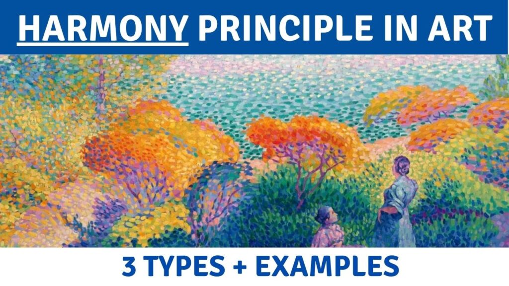
In Henri-Edmond Cross’s “Two Women by the Shore, Mediterranean” painting below, the prominent artist’s organic shapes throughout the artwork are used to create harmony with shapes.
This is also a wonderful example of how harmony is used, including texture and color harmony.

The use of circular geometric shapes in Paul Nash’s “Mineral Objects” also displays how harmony can be achieved with shapes. Even the background is composed of circular forms. Nash’s painting is visually pleasing because the shapes all work together cohesively.

Harmony in Textile Patterns
The repeating patterns made by 19th-century British textile designer William Morris are excellent examples of how shapes and form can be utilized to achieve harmony in arts.
The famous fruit pattern below has the perfect balance of organic shapes, color, movement, and negative space. These combined art elements create a harmonious image that is not too monotonous.

3. Texture Harmony
Texture harmony is produced through brushstrokes. Consistent brushstrokes throughout a painting will create harmony because the entire artwork is composed of the same textural rhythm.

Examples of Texture Harmony
Texture can be created through art techniques such as the impasto technique, which is when the paint is thickly applied to the surface to keep the imprint of the artist’s brush. This can be achieved simply with paintbrushes, or by using tools such as a palette knife.
In the video below, you can watch the impasto vs sfumato examples:
Vincent Van Gogh famously used the impasto method to create texture harmony in his paintings, which we’ll take a look at below in two examples.
The Impasto Technique

In “Olive Trees with yellow sky and sun” by Van Gogh, the texture harmony is apparent because of the consistent ratios of similar or related textures throughout the painting. From the trees to the yellow sky, the brushstrokes are all in beautiful unison with one another.

In “Cypresses,” Van Gogh’s use of the impasto technique to create texture is extremely apparent. The thickly applied paint and curvy lines create an almost three-dimensional effect, and this texture brings a sense of cohesiveness to the painting.
The Pointillism Technique
Pointillism is an art technique used to create the illusion of texture by painting small, distinct dots or strokes of color. With this method, texture is achieved when viewed by the human eye from a distance.
The method was pioneered by the French Post-Impressionist artist Georges Seurat.

In Seurat’s highly influential painting“A Sunday Afternoon on the Island of La Grande Jatte,“ the pointillism style is utilized throughout each tiny section of the painting, which creates a unified texture.
Take a close look at the compacted microscopic dots to see how they all incredibly blend to form the painting’s soft texture.

Henri-Edmond Cross’s “The Pink Cloud” painting is another example of how pointillism can be used to produce texture harmony in art.
Notice how no section of the canvas is missing this technique, and the dots are consistently the same sizes. This greatly enhances the overall level of harmony in the painting.
Harmony Principle – Key Takeaways
Harmony is one of the seven principles of art. It is achieved when similar or related art elements within a composition work together to produce that visually satisfying effect that occurs when the elements are in unison with each other.
Although harmony and unity are similar, they are two separate principles of art. While harmony refers to the various elements that work together, unity considers the artwork’s overall wholeness.
Three types of harmony in art include color harmony, shape and form harmony, and texture harmony.