What is color in art, and why is it important? Let’s explore color theory, color wheel, and examples of how artists use color in art effectively.
What is Color in Art?
Color in art refers to the way we see different shades and tones in pictures or paintings. It’s created when light waves hit an object’s surface and are then reflected back to our eyes.
Subjects appear to have different colors because certain wavelengths of light are absorbed, and others are reflected. This results in different wavelengths of colors being perceived.
In a literal sense, humans react to color because of the optic nerve, which allows our brains to create visual images. But our exposure and personal conditioning towards color will influence how we experience color in art.
Because of this, color in an artwork is considered to be subjective based on the viewer’s own interpretation.
Color can be categorized into three properties (hue, saturation, and value), which we will dive into later on in the article. Artists can use these properties to create a range of colors that convey distinct moods.

The 7 Elements of Art
Color is one of the elements of art, not principles of art. You can learn about each principle of art and element of art in the linked articles below:
The 7 Principles of Art
- Balance
- Contrast and Emphasis
- Movement and Rhythm
- Unity and Variety
- Harmony
- Pattern
- Proportions and Scale
Why is Color Important in Art?
Color is essential in art because artists often use it to depict different emotions, describe the subject, and set the atmosphere.
Color can psychologically impact the viewer because of its ability to produce strong emotional responses. Warm colors like yellow, orange, and red can provoke anger, excitement, vibrancy, or energy.

On the other hand, cool colors like blue, green, and purple can portray a sense of sadness, calmness, or tranquility.
By using color in strategic ways, artists can achieve a specific mood.

Color is also important because artists can use it to create depth and form. By varying the color values, artists can generate the illusion of shadows, light, perspective, and texture.
Hue, Saturation and Value
The three properties of color are hue, saturation, and value.
Let’s take a look at each one individually.
Hue is the name given to a color, such as yellow, green, red, orange, blue, or purple. It refers to the specific wavelength of a color.
Saturation is the color intensity or purity. The saturation level is determined by the extent to which a color has been mixed with another hue.
A highly saturated color is pure and intense. When painting, these colors come directly from the paint tube. Colors become more muted and less intense when combined with different hues.
You can reduce the intensity of a color by mixing it with gray or with its complement, such as blending red with green or blue with orange.

Value is a color’s lightness or darkness. Mixing white or black with a hue can change a color’s value in drastic or subtle ways.
In color value, a tint is when a color is mixed with white; a tone is when a color is mixed with gray; and a shade refers to when a color is mixed with black.

Color Theory
Color theory refers to the principles and guidelines in art and science that explain how humans perceive and use color. It deals with how colors interact, mix, contrast, complement each other, and convey meaning.
By understanding color theory, artists can draw attention to the artwork and make an impact through the use of color. Color theory is an essential tool for creating effective and meaningful designs and compositions.
Watch the video below to learn more about color theory and how you can use it:
To fully grasp color theory, it is important to be aware of the color wheel, which we’ll examine next.
Learn the complex topic of color theory in a clear and easy way with the “Color Theory Bootcamp” course by Bill Perkins. Discover the idea of a strong Matrix, mood, Major and Minor Keys, color schemes and more!
Over 14.5 million students took the course and the number is growing daily. I learned a lot from taking it myself, and I definitely would recommend it to any beginner and advanced aspiring artists.

Exploring the Color Wheel
In the late 17th century, Sir Isaac Newton developed the traditional color wheel, which is the structure of the color theory.

The color wheel visually displays colors with hues arranged based on the color’s wavelength. This clever way of color organization helps artists find harmonious color combinations.
Best known for his physics breakthroughs, Newton placed the color spectrum into a circle. He discovered that clear light consists of seven visible colors, which we call the ROYGBIV of the rainbow––red, orange, yellow, green, blue, indigo, and violet.
After splitting white light into a color spectrum using a prism, Newton wrapped the resulting colors around themselves to create the color wheel. This groundbreaking discovery is how red, yellow, and blue became widely accepted as primary colors.
Color wheels depict the relationship between primary, secondary, and tertiary colors.
Primary Colors
The three primary colors are red, yellow, and blue. Since primary colors can’t be re-created by blending colors, they are considered the building blocks from which all other colors are created. On the color wheel, primary colors are equally spaced apart.
Also known as the most basic colors on the color wheel, the natural pigments in the three primary colors (RYB) make it possible for us to see the entire color spectrum of the world around us.

Secondary Colors
Secondary colors are formed by mixing equal parts of two primary colors. When looking at the color wheel, you can see the secondary colors between the primary ones.
Green, orange, and purple are the three secondary colors created when mixing primary colors. You can make green by mixing yellow and blue, orange from red and yellow, and purple from red and blue.
Tertiary Colors
A tertiary color is created by mixing equal parts of a primary and secondary color. On the color wheel, tertiary colors are positioned between primary and secondary colors.
Combinations of the six tertiary colors include:
- Blue-green
- Blue-violet
- Red-orange
- Red-violet
- Yellow-orange
- Yellow-green
Note: When referring to the six tertiary colors, the proper way is to list the primary color first and then the secondary color.
Color Temperature in Art
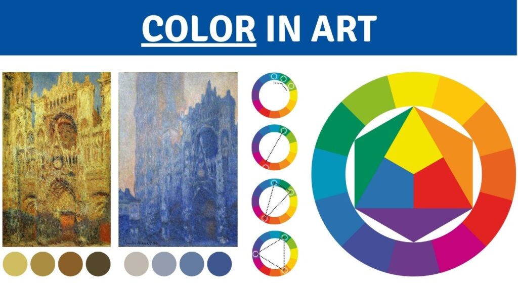
Color temperature is the visual warmth or coolness of a color. Artists often use temperature to depict the atmosphere of an artwork.
Claude Monet played with color temperature in his Rouen Cathedral painting series shown below.

In the above painting, “Cathedral at Dawn”, Monet used the cool blue primary color. Ranging in color value, these dark colors help to bring about a feeling of tranquillity. The yellow-orange sky suggests the beginning of a sunrise.
Painting the same cathedral a few years later, the artist used warm shades of yellow-orange to illustrate the cathedral during sunset. There are also hints of yellow-green, which is used to give off the illusion of shadows from the sunlight.
The “Color Survival Guide” class is great if you want to learn more.
Color Schemes in Art
Color schemes are one of many tools artists use to illustrate a mood of an artwork, communicate a message, or create a harmonious, aesthetically pleasing composition.
When artists choose a particular color scheme in their work, they must consider if it matches the tone they set out to create.
There are many color schemes, including monochromatic, analogous, complementary, split-complementary, triadic, and tetradic.

Let’s dive into each one:
Monochromatic Colors
A monochromatic color scheme primarily consists of different shades, tints, and tones of a single hue.
It means using variations of only one color to create a harmonious image.

Vincent Van Gogh depicts a mostly monochromatic color scheme in his famous 1888 “Sunflowers” painting, shown in the image above. He uses various color values of warm yellow hues.
Analogous Colors
An analogous color scheme uses colors that are next to each other on the color wheel.
This color palette creates a unified look since the colors are closely related and share similar undertones.

In Claude Monet’s “The Water Lily Pond,” the renowned artist used a green analogous color scheme featuring blue-green, green, and yellow-green. These analogous colors combine to make the painting feel serene, natural, and alive.
Complementary Colors
Complementary color schemes use colors opposite to each other on the color wheel, such as red and green, yellow and purple, or orange and blue.
This palette creates a vibrant and contrasting effect by making use of the stark differences between these opposing hues.

Vincent Van Gogh often used complementary colors in his paintings. In the painting above, he used the coolness of the primary color, blue, with the secondary color of warm, light orange values to make “Ernte in der Provence.”
The warm colors work stunningly in contrast with the cool colors to produce a balanced and harmonious painting.
Split-complementary Colors
A split-complementary scheme uses a base color and two colors adjacent to its complement on the color wheel.
Examples of these color combinations include red, blue-green, and yellow-green; blue, red-orange, and yellow-orange; or yellow, blue-purple, and red-purple.

Take the image above, for example. Claude Monet’s painting uses the split complementary color combination of red, blue-green, and yellow-green. The hues within this color scheme generate a harmonious and visually pleasing work of art.
Triadic Colors
A triadic color scheme uses three colors evenly spaced apart on the color wheel.
When you place a triangle on the color wheel, the three colors that come together at each point produce the triadic color scheme.
These combinations include the primary colors of red, yellow, and blue. You can also use purple, green, and orange color schemes or blue-green, yellow-orange, and red-purple.

One triadic color scheme example is Johannes Vermeer’s “The Milkmaid”. In it, we can see the blue, yellow and orange colors and how well they work together in balance.
Tetradic Colors
Tetradic schemes, or double complementary colors, use four colors evenly spaced apart on the color wheel.
For example, a combination of red, green, blue-purple, and yellow-orange; or yellow, purple, blue-green, and red-orange.

Claude Monet masterfully demonstrates the power of a tetradic color scheme in his painting “House of Parliament, London, Sun Breaking Through Fog.”
The balance between the vibrant red-orange, yellow, and purple creates an intensity that is subdued with the cool blue colors.
Color Principle – Key Takeaways
Color is one of the 7 art elements created through reflected light. It is an essential tool for artists to communicate emotions and establish the mood of their work.
Artists also use color to describe their subject matter and make a visual impact.
The three primary properties of color are hue, saturation, and value.
Artists work with the color wheel, color theory, and various color schemes to help guide their use of color.


One Response
Thanks a lot this is helping