What is proportion in art? Proportion and scale refer to one of the 7 principles of visual art.
In this article, let’s discuss the difference between proportion and scale, 4 proportion types and their examples in art. Afterward, we’ll look at some ideas on how you can implement proportion in your own art.
Let’s dive in.
Scale and Proportion in art definition
Before moving forward, let’s define proportion to differentiate it from other art principles.
Proportion in art is one of the seven principles of art that refers to the relativity of size within the composition. This term describes the relationship between the size of one element of the composition compared to another. It’s responsible for organizing and arranging the structural elements of the artwork.
In simpler terms, the proportion principle of art looks at how one element relates to another. It’s like when you make a tower with lego blocks – a big block at the bottom and a small one at the top makes the whole thing look just right.
 1")
Scale in art is the size of an object or figure relative to the size of other objects or figures in the same work of art. It is a comparison of sizes between elements in a work of art and is used to create visual balance.
In simpler terms, scale refers to how big something is compared to other objects. For example, figures standing next to a house are much smaller than the house – and that’s a measure of scale.
The difference between scale and proportion in art
The difference between scale and proportion in art is that scale deals with the overall size of objects, while proportion deals with the relationship between the sizes of different objects.
 2")
For example, a work of art may have a small figure in the foreground and a larger figure in the background. The size relationship of the figures is an example of proportion. Scale, on the other hand, deals with the actual size of the figures themselves.
Proportion is zooming in on the details and looking closer at the relationships of objects, and scale is zooming out and looking broader at how the different parts compare as a whole.
The 7 Principles of Art
 3")
You can learn more about the other principles and elements of art in the linked articles below.
- Balance (what is balance in art?)
- Contrast and Emphasis (learn about contrast here) (learn about emphasis here)
- Movement and Rhythm (learn about Movement here) (learn about rhythm here)
- Unity and Variety (learn about variety here) (learn about UNITY here)
- Harmony (learn about harmony here)
- Pattern (learn about patterns here)
- Proportions and Scale (we are reading about them now!)
The 7 Elements of Art
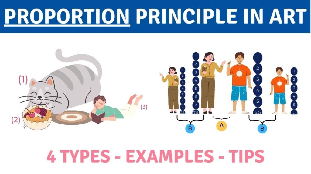
The Types of Proportion in art
There are four types of proportion in art: Standard Proportion, Altered Proportion, Hierarchical Proportion, and Out of Proportion. Compositional proportion and the Vitruvian Man are also widely used as tools by artists.
Standard proportion in art
Standard proportion in art refers to using the “correct” or natural proportions for any given object. This applies to all figures, nature and still life.
While some argue that it’s impossible to have the correct proportions for everything, like human figures, where each one differs. It still works as a standard proportion if everything in the artwork looks natural, proper and believable.
For example, an artwork featuring a large tree in the foreground and smaller mountains in the background. While in real life, the mountains will be larger than the tree, due to the laws of perspective, making the tree appear larger would be a correct use of standard proportion.
 4")
Altered Proportion in art
Altered proportion refers to intentionally modified sizes of elements in order to create a specific effect. It’s also often referred to as an “exaggerated” proportion as it’s used to emphasize certain parts of the work.
Altering, modifying or changing any standard proportion in any way would be considered an Altered proportion.
This type of proportion is commonly seen in anime art style, where the eyes of the characters are intentionally made larger and lips smaller. Or, in chibi style, where artists create an extremely out of proportion character’s body, and so the head seems bigger.
For example, if an artist wanted to emphasize how tiny a bird sitting on a tree is, they could intentionally make the bird way smaller or double the relative size of the tree.
For example, in this free art lesson, you can learn how to apply facial anatomy proportions to caricatures.
 5")
Hierarchical Proportion in art
Hierarchical proportion in art refers to when the size of elements is determined by their significance to the overall artwork. The more important a subject is, the more prominent its place in the composition.
During the Dark Ages, Middle Ages and especially for ancient egyptians, it was common practice to depict people of higher status as larger than common folk. This practice slowly started deteriorating during Renaissance, when the focus shifted to more natural proportions.
This type of proportion is still used by artists now in more surreal illustrations to drive a point across.
 6")
Out of Proportion in art
Out of proportion refers to using incorrect sizes of subjects when compared to one another. This type of proportion can be done deliberately to make a point or indeliberately due to the lack of skill or focus of the artist.
Out of proportion elements can work together to make a stronger point, for example, a larger-than-life muscular man gently holding a puppy the size of an apple. This exaggeration of proportions can play a significant role in explaining the difference in their physical size.
You could also depict any ordinary objects in a monumental scale in relation to other objects, like a giant book larger than a human body.
Or, as in the case of many beginner artists, out of proportion can simply mean drawing one eye smaller than the other. Usually done by accident, and yet, it falls under the category of out of proportion.
 7")
The use of Proportion in art
Proportion in art can be used for various purposes and mixed effects. Some art styles include an intentional lack of proportion, unrealistic proportions, and distorted art objects; others use proportion rules for proper realistic style and eye-catching composition.
By manipulating proportion, artists can emphasize meaning or significance, convey emotions and deliver a message. Here are a just a few examples:
- using juxtaposition between objects to add humor,
- emphasizing the difference in size relationships between objects,
- highlighting specific features (for example, anime eyes),
- determining the location of one object compared to another – i.e., the bigger objects are often considered to be in the foreground, etc.
In current times, the purpose of art is very broad. An artist doesn’t necessarily have to follow the rules of proportions for their artwork or design to be beautiful and attract an audience.
But it’s still important for artists to know the rules so they can break them in style.
Compositional Proportion
Compositional Proportion in art refers to arranging elements within a composition in a way that makes the final artwork aesthetically pleasing to look at.
One of the most popular concepts for making the composition look good is called the Golden Ratio, discovered by Euclid in ancient Greece.
It can be written mathematically as 1:62 – one object is 1.62 times the length of the other one.
The Golden Mean (another name for the Golden Ratio) can be illustrated as a line that’s divided into two segments. The relative relationship of the part to the second is the same as the relationship of the second part to the whole line. The divided lines go on, forming a spiral or rectangles within a rectangle.
 8")
The golden proportion is widely found in nature, from shells to even galaxies. And since we’re used to seeing it in nature, it’s considered to look “natural” and calming to our eyes in art and design.
Another concept of compositional art proportion is known as the Rule of Thirds – a somewhat simplified version of the Golden Mean. It splits the image into thirds vertically and horizontally, and the overlapping areas are considered to be naturally pleasing to draw the eyes as focal points.
It’s generally better not to place the main objects in all four of them to avoid visual overload, but you can emphasize more than one as well.
This free lesson breaks down the rule of thirds composition very well.
 9")
The Vitruvian Man
The Vitruvian Man is a “crossover” between the Golden Mean and human body proportions. This mathematical formula of the perfect proportion of the human body within a circle and a square was illustrated by Leonardo da Vinci and named after a Roman architect named Vitruvius. Vitruvius studied human proportions and applied them to his architectural designs.
 10")
The perfect human proportion may not exist at all because no human is the same. The perception of the ideal human body, both male and female, has changed a lot throughout the history of humanity and art.
However, there’s a narrow range of human proportions that are considered to be realistic in art. They don’t apply to arm or leg length but the overall relations of body parts to one another.
In art, human body proportions are usually measured in relation to the human head. The average head-to-height ratio is 7.5 to 1, which means the overall height of an average human includes 7.5 lengths of their head.
For example, let’s look at Michaelangelo’s David:
 11")
If the character is a superhero or someone extremely powerful in general, the artist can intentionally make their human figure one or two heads taller.
Two portrayed characters can have the same body-to-head proportion but differ in height. It’s also important to know that the general proportions for children’s human form are very different from those of adults.
 12")
It isn’t just the human figure that can be divided into proportions – animal bodies have average shapes too. They can be found in multiple sources and used for realistic portrayals of animals, insects, fish, etc.
Learn about average figure proportions in this free lesson.
Facial features proportions
Knowing the proportions of the human face is crucial for artists who want to work with portraits, including stylized ones.
First, it helps avoid huge mistakes while drawing someone from imagination.
Second – facial proportions are a base for capturing portrait likeness.
Although it’s believed that we’re more attracted to symmetrical facial features, the way each human face is different from the “average” proportion is what makes us different and recognizable.
 13")
Here are some of the few generalizations on human facial proportions:
- The head is typically five eye widths across and is generally taller than it is wide.
- The brows usually line up with the tops of the ears
- The mouth is closer to the nose than to the bottom of the chin.
These measurements, of course, vary from person to person, but the general idea is more or less in touch with the human’s head anatomy.
Check out this class on the proportions of the human head.
Proportion in Art Examples
To understand proportions better, let’s have a look at some examples!
 14")
Basket of Fruit painted in 1507-1600 by Caravaggio, creates a sense of peace and order. The fruit is in correct proportion and is especially realistic – the grapes are smaller than an apple, and pear leaves are smaller than grape leaves.
The artwork is considered one of the prime examples of still-life paintings, and the great use of Standard Proportions is perhaps one of the reasons for it.
 15")
Madonna and Child with Angels and St. Jerome, 1535-1540, is a painting by Girolamo Francesco Maria Mazzola, also known as Parmigianino. This artwork is widely known as The Madonna with the Long Neck due to the specific exaggerated proportions of the neck. This painting is a great example of Out of Proportion.
In an attempt to make Madonna seem elegant and ethereal, the artist made her neck extremely long for a human, as well as her fingers unnaturally long and thin.
Another character, St. Jerome, is made very small since he’s in the distance from the viewer, and the proportions of baby Jesus don’t look like baby proportions at all.
 16")
St. John the Baptist is an artwork by Domenikos Theotokopoulos, also known as El Greco (1597–1607). It’s an example of a painting with purposefully distorted human proportions with an unnaturally thin and stretched figure.
The artist believed that by stretching the body proportions, he makes the viewer’s eye look upwards and think about God more. This painting falls under the category of Altered Proportions.
 17")
The Maestà, or Maestà of Duccio by Duccio di Buoninsegna in 1308–1311 is a great example of Hierarchical proportion.
The central focus is Madonna and The Child, who are deliberately depicted as large scale in comparison to the saints or angels, which gives them a sense of more significance.
 18")
The Annunciation by Leonardo da Vinci is an oil painting that was created around 1472, and it can be viewed as a great example of the Golden Mean. The composition looks neat, well-organized, and very balanced.
If you draw a line from the building down, you will see the precise golden mean proportions starting to take place. The ornament on the small table, Mary’s clothing, the trees in the background, and some other objects are placed according to these rules as well.
 19")
Umezawa Manor in Sagami Province, created in 1830-1835 by Katsushika Hokusai, showcases the use of proportion to emphasize depth and distance. The woodblock print features several cranes in the foreground and Mount Fuji in the distance, creating a stunning gradient background.
If we draw imaginary lines across this image, we can see the use of the rule of thirds.
How to get started with proportion in your own artwork
1) Practice is the best way to memorize the proportion rules before you can apply them without thinking. Using photos as references, drawing from nature and doing master studies can significantly improve your intuitive understanding of proportion.
2) Always create a sketch before drawing or painting the entire artwork. It will help you evaluate the proportions and whether the composition feels right.
3) Remember that you don’t always have to follow all the rules, but using a common human understanding of the relationships between objects should help.
4) Create the artwork and enjoy the process! Even if you’re not great at proportions at first, your intuition and skill will grow with time.
Summary
Proportion in visual art refers to one of the 7 principles of art that is responsible for the relativity of object sizes within the composition and describes their relationship when compared to one another.
Scale and proportion are not the same, as scale refers to the relative size of objects and proportion to the relationship between sizes.
The four types of proportion in art are Standard Proportion, Altered Proportion, Hierarchical Proportion, and Out of Proportion.
Artists often use proportion tools such as compositional proportion, Golden Ratio and the Vitruvian Man.
You can improve your use of the Proportion Principle of art with time, practice and observation.
Proportions Principle – Infographic
 20")
 21")