Let’s discuss what is variety in art.
Variety is something we encounter all the time in our day-to-day lives. But how to apply this to visual art and learn to see it with an artistic eye?
What is variety in art?
Variety in visual arts refers to the use of the seven visual art elements to create interest, contrast, and complexity in the artwork. It is a principle of design that allows artists to add depth, dimension, and complexity to their compositions and enhance the viewer’s overall visual experience.
Think of it as something that opposes unity but works in balance with it to create a great composition – a yin-yang kind of situation.
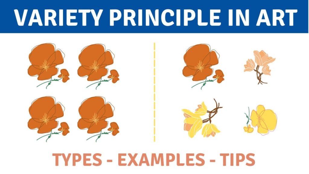
Variety in art is necessary for what can be simply described as “getting rid of boredom.” Monotony most likely wouldn’t catch the viewer’s eye, so much interruption is quite necessary. It’s the principle of art that adds interest and distinctiveness to your artwork.
It works through contrast and juxtaposition, and, basically, every time you see different visual elements placed next to one another, it’s variety. Even by slightly tweaking some details, you can add significant variance to an otherwise repetitive artwork.
 1")
Different art elements VS principles
Variety in art is considered a part of the principles of art. You see, visual art terms can be separated into two categories: the 7 elements of art and the 7 principles of art.
You can read more about them below.
The 7 Principles of Art are:
- Balance (learn about balance)
- Contrast and Emphasis
- Movement and Rhythm
- Unity and Variety (we are reading about variety now!)
- Harmony
- Pattern
- Proportions and Scale
The 7 Elements of Art are:
Each art element and principle plays a significant role in the creation of fascinating and complex artworks.
 2")
The 3 Types of variety in artwork
How exactly do artists achieve variety in art? Variety is present virtually everywhere and can be practically anything, but is there a method behind it?
There are three commonly known methods of adding variety to the composition. You can also call them the three types of variety.
Contrast.
Using forms, textures, and colors that differ significantly from one another. It makes the artwork more dynamic and eye-catching.
Change and difference.
This implies that you’re repeating the art elements that are pretty similar but only changing one aspect of them. Hue, position, size – this difference will draw viewers attention even if subtle and make the work interesting while still keeping it unified.
Elaboration.
Elaboration in art refers to adding extra details and complexity to increase interest in your work. For example, intricate capital letters at the beginning of ancient handwritten scripts.
However, you don’t really need to define your chosen way of adding variety in art by a certain method. You can use multiple or just a couple of types at a time.
 3")
How artists add variety to their artwork
There are multiple ways in which artists add variety to their complete composition. It is rare that an artwork includes only one element; most of the time, it’s a combination of numerous methods and various elements.
Let’s discuss them one at a time.
1. Color Variety
The color variety implies varying your saturation, value, and hue.
Saturation represents the intensity of your color, and how vivid it is.
Hue means the color’s location on the color wheel.
Value defines how dark or light the color is (think about how dark or light it would look if you turned your work to greyscale).
For example, varying saturation can result in very intriguing results. For example, you could make most of the image desaturated but leave a spot of wildly saturated color. This might, in turn, become the focal point of your artwork.
Yet, if you make very tiny saturated specs throughout, it could simply result in added visual interest and a sense of harmony.
Check out this list of 20 best art books to learn more about colors and color theory.
Or learn from Marco Bucci’s Color Survival Guide.
 4")
2. Brushwork Variety
Brushwork variety is not only about the result within the painting; it’s also a lot about what’s on the “artist’s side” of the painting process. By altering your technique, you can bring incredible changes to your artwork, almost unlimited in its diversity.
To make your brush strokes different, you can try changing how you hold the brush and/or the amount of pressure you put on it. You can try picking up more paint or making your paint more or less thick.
The angle of the brush plays an important role as well, especially when you’re painting the largest shapes across the canvas. Or, you might choose to apply paint with a different tool, like a palette knife.
Creating variations like these within your art, makes the artwork much more engaging to look art.
Learn about texture and mark-making in this class.
 5")
3. Line Variety
Line variety can influence your artwork greatly since it’s one of the fundamental art elements.
You can change any parameter of your lines and see how drastically the tone and look of your work can change. Lines can be thick and thin, short or long (in hatching as well), curved or straight.
If you don’t work with linework, lines also refer to visible brushstrokes, textures and implied lines. (link to an article on what implied lines are and how to use them)
 6")
4. Shape Variety
Shape variety, or its absence, is usually very easy to notice. The same shapes throughout the composition look repetitive and bland (unless that’s what you were going for).
Shapes can be bigger or smaller, lighter or darker, organic or geometric, and have more or less visual weight. You’re more than welcome to alter these parameters and see an entirely different harmony in your artwork.
Juxtaposing very different forms can result in an unexpectedly unique look. Using geometric shapes close to organic shapes create variety. This works for both positive and negative shapes. in the negative space.
If you need to use repetitive shapes, try adding different elements, or making them different sizes to introduce variety in art.
 7")
5. Size Variety
Size variety is self-explanatory, and even if you repeat the same object multiple times, you can change up their sizes to add visual appeal.
Even if the things you’re capturing are monotonous and repetitive, play with the size of the elements a little. Add some perspective, and make some objects bigger or smaller on purpose. This will help spice things up and produce good art.
 8")
6. Technique Variety
Some artists induce variety by changing their working techniques. In a way, it’s similar to the brushwork variety, but in different art mediums, it can be applied differently.
For example, a specific element of your piece can be done with a different application technique, like:
- Underpainting
- Glazing
- Dry Brushing
- Splattering
- Dabbing
- Pouring
- Stippling
- Gestural
- and so on.
When you combine two or more different techniques in your work, you introduce technique variety into the piece.
 9")
7. Edge Variety
An edge in art represents the transition between two shapes, which can be hard, firm, soft or lost. Paintings, drawings and photos all have a multitude of edges; all it takes is knowing where to look.
If you are interested in learning more about edges and how to implement them in your art process, check out Marco Bucci’s YouTube video on the topic. I find his channel to be a very entertaining and useful free art education resource.
 10")
Examples of Variety in Art
Now that you know about variety in theory, let’s take a look at some incredible classical paintings to find out how it is used in practice.
By the way, I like to look at classical artworks on Google Arts & Culture. It’s a free website where you can like your favorite works and build libraries for references and inspiration.
 11")
The Ideal City by Fra Carnevale, from about 1480-1484, is a great example of the variety. It’s a painting with an overall symmetrical composition that uses various methods of variety to make it an interesting piece to look at.
- Adding human figures that break the overall symmetry (learn about the 7 symmetry types).
- Various shapes and sizes – the buildings on each side of the axis are different from one another;
- A variety of colors throughout the piece;
- Various edges – for example, stairs vs clouds in the sky;
- Various brushwork and techniques – clouds vs buildings.
 12")
Italian Landscape with Umbrella Pines was created in 1807 by Hendrik Voogd. This painting is a wonderful example of size and shape variety. It depicts several detailed trees of the same type in the foreground, but they don’t look repeating or boring.
The trees vary in size, some being taller than others, and it gives them a realistic look. They also have slightly different shapes of their trunks and branches, although these differences are subtler than size.
Of course, colors, edges and technique varieties are present in this painting as well.
This is also the case for most of the artworks below, so I will only be pointing out the strongest variety from this point on (in my view), and I’m sure you can spot the rest on your own!
 13")
Joshua Commanding the Sun to Stand Still upon Gibeon, a painting by John Martin, was created in 1816. It’s a mesmerizing example of how well the contrast method of variety can work even on a larger scale. The entire beauty of the composition is driven by the bold shape variety.
The dark and angular shape of the cliff contrasts with the softer shape of the clouds and the lighter shape of the faraway mountains. This juxtaposition creates variety and balance at the same time. The smooth curves of the trail also contrast against the straight lines of the buildings and the angles of the cliff.
 14")
Fine Wind, Clear Weather, also known as Red Fuji, from the series Thirty-six Views of Mount Fuji is a print created by Katsushika Hokusai in about 1830-1831. It perfectly uses color contrasts and texture variety to create variety in otherwise very minimalistic work.
The colors – red, green, and blue – are in unity with one another, yet create a contrasting difference that adds variety to the work. The color red also has a slight gradient at the top of the mountain, which is a hue and saturation variety. Adding the forest at the bottom creates a texture change and adds more visual variety, even though both the forest and the bottom of the mountain are green.
 15")
Woman Reading a Letter by Johannes Vermeer, 1663, is a stunning example of color variety. The color palette of the entire painting is soft, muted, and desaturated, but the blue night robe the woman is wearing stands out immediately and glues the viewer’s eyes to itself.
This splash of brighter blue, although it still fits the soft and cool color palette, adds variety without ruining unity and balance. The painting also features shape variety: the soft, organic shape of the woman contrasts against the straight lines and edges of the furniture in the room. If these soft lines of her figure weren’t there, the shapes of the furniture would’ve looked dull and monotonous.
 16")
Gondolas on the Lagoon (Grey Lagoon), 1765, painted by Francesco Guardi, is an artwork in which the variety is subtle, but perhaps saves the entire composition. The painting is made grey, muted, and minimalistic on purpose to create a certain atmosphere, but it still has some details to notice.
The line of the buildings on the horizon breaks, and with it, so does the repetitive pattern, making the right side of the painting slightly different from the left. The left side, to balance the large shape of the main gondola, has two smaller gondolas, which further adds to the asymmetry and variety.
How to get started with variety in your own work?
Let’s find out how you can work towards achieving perfectly balanced variety in your work.
1) Start by determining what exactly you want your work to be like. What theme would it be about, what kind of emotion does it convey, and what genre do you prefer for it?
2) Make several drawing sketches, in color as well, to try out different methods for adding variety. Do you want to play with shapes, or will the line variety work best for that concept? Don’t skip this step even if you’re completely sure; there’s always a chance that doing it slightly differently will elevate your work.
3) Create your artwork and remember to evaluate it during the creative process. It’s important to keep balance and know when to stop. Having too much variety or too much harmony can make the art piece incomprehensible and aimless. So take a second to step away from it every once in a while to see it with a fresh pair of eyes.
In all fairness, thinking of variety the whole way through might not be sustainable for most work. Focus on the meaning and the idea you want to convey, and use variety as the cherry on top rather than the means to an end.
Using variety in art as finishing touches to emphasize your original ideas is a great way to work for an artist.
 17")
 18")
Key Takeaways
Variety in visual art is using different qualities of the elements and creating visual diversity to add complexity to your artwork. Repetitive elements tend to look boring, and variety helps the viewer’s eyes stay on the artwork longer and explore everything.
Variety can be achieved in many ways. There are three commonly known methods, which can also be called the three types of variety: contrast, change and difference, and elaboration. However, you don’t have to use them strictly; instead, alter the parameters (brushwork, color, shape, etc.) in any way you like.
To get started with variety in your own artwork, you’ll need to imagine the idea in your head and make several thumbnail sketches to try out different things and methods. Then you’ll need to evaluate your artwork throughout the entire creative process. It’s essential to keep balance and not make your work incomprehensible by adding too much variety.
FAQ
What is the function of variety in art?
The function of variety in art is to add visual interest by contrasting and juxtaposing the elements of art within the composition. It also helps to break up the monotony and create a more visually compelling experience.
Is variety an element of art?
Variety is not considered one of the traditional elements of art, but is regarded as a principle of design. However, variety plays a crucial role in how the seven elements of art are used in a work of art.
What is the difference between unity and variety?
Unity and variety are two important principles of design in the visual arts. Unity refers to the sense of wholeness in a work of art, meaning that everything looks like it belongs together. Variety, on the other hand, refers to use of different elements to create contrast and diversity, meaning using different things together to make art look more interesting. The best art uses both and finds a happy balance between the two.