We often use the word “symmetrical” in our daily lives; it just comes to us intuitively. But what exactly is symmetry in drawing, art and design?
In this article, you will:
- Learn the definition of symmetry.
- Explore different symmetry types.
- Examine symmetry examples from the old master artists.
- Find out how to use symmetry in your art.
Let’s dive in!
Table of Contents
What Is Symmetry In Art?
Symmetry in art is a formal type of balance that consists of mirroring portions of an image. As a general rule, a symmetrical drawing has identical parts mirrored across the symmetry line, implied or actual.
The mirroring might not be exact with symmetry, especially when it’s not a geometrical drawing. Yet, if you can draw an obvious symmetry line on top of an image, symmetry is involved.
Symmetry can be found almost everywhere in nature, even in the human body itself, starting from your very own face. Leaves, flowers, fruit, butterfly wings – look closely, and you will find symmetrical things everywhere around you.
Symmetry is also quite common in many major architectural works and styles – it gives buildings a tone of power, stability, and monumentality.
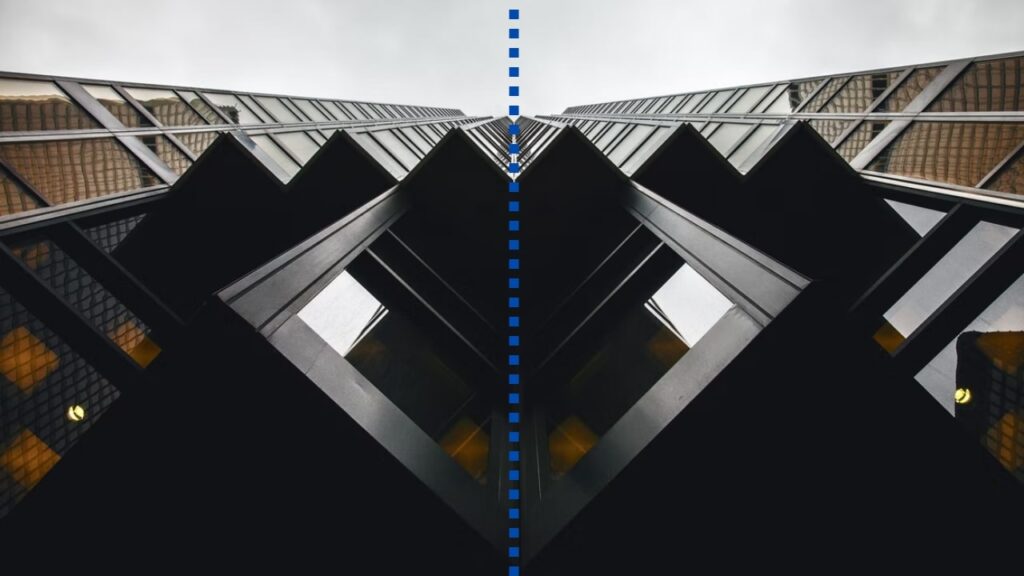
However, creating art with symmetry can be tricky since it requires some compositional planning and a developed sense of balance from the artist.
Symmetry can get boring and lack variety. So it’s important to make art visually interesting in any creative way you can. To make your work more diverse, artists often add more complicated details and features, patterns, textures, figures, and near symmetry (discussed later in the article).
The break of symmetry is called asymmetry – an intentional lack of balance can emphasize the necessary part of the artwork. Symmetry and asymmetry can be beautifully combined in the same drawing, creating an eye-catching pattern break.
- Up next: learn more about the different types of lines used in art.
How Important Is Symmetry In Art?
Symmetry is an important technique used in art to provoke a sense of uniformity, order, clarity and consistency. It’s essential to use symmetry or asymmetry in your composition to achieve a specific sensation.
A famous example of symmetry in art is The Last Supper by Leonardo Da Vinci. It uses near symmetry and has a strong sense of the image being balanced and symmetrical across the vertical axes. The painting uses symmetry as an important technique to point the viewer’s eye to its focus – the central figure of Jesus.
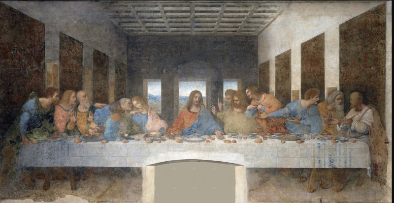
Leonardo Da Vinci, c. 1495–1498.
Symmetry is also crucial in designing patterns, mandalas and backgrounds.
The 7 Types Of Symmetry In Art
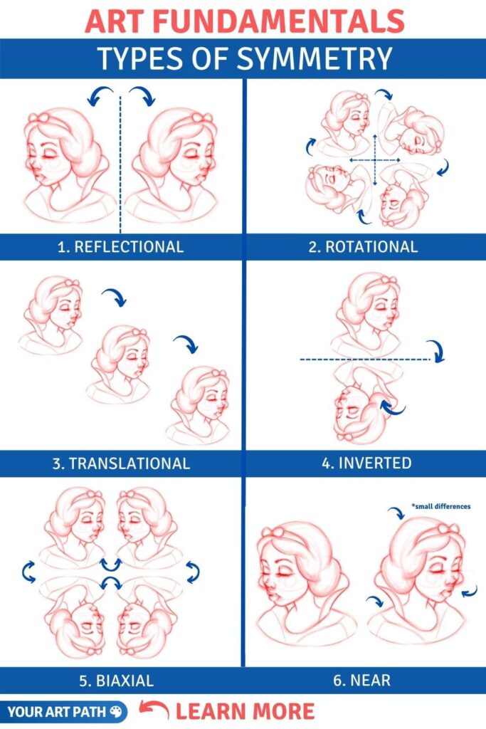
While there are many different types and names for symmetries, six types of symmetry are commonly present in art.
They can all be applied in different situations to create balance and emphasize certain things and objects. Sometimes, a few different types of symmetry will be present in one artwork.
I created this video for you that shows different examples of symmetry types:
#1. Reflectional Symmetry
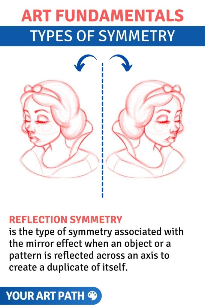
Reflection symmetry is the type of symmetry associated with the mirror effect when an object or a pattern is reflected across an axis to create a duplicate of itself. It’s probably the most common type of symmetry and the first one that comes to mind – think of butterfly wings or a human body.
Reflection symmetry is also known as bilateral symmetry, although these terms are not interchangeable. Every case of bilateral symmetry is reflection symmetry, but it’s not always the other way around.
Reflection symmetry can have any direction: the symmetry axis, across which an object is reflected equally, can be diagonal, horizontal, vertical, and at any angle. Bilateral symmetry, however, is precisely the one when the axis is vertical.
This form of symmetry will give the artwork and the viewer a sense of power, balance, sturdiness and formal organization.
Reflection symmetry example:
#2. Radial Symmetry
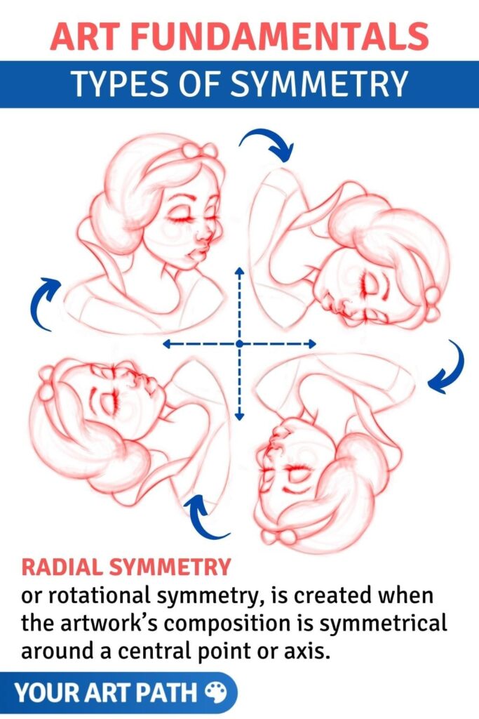
Radial symmetry, or rotational symmetry, is created when the artwork’s composition is symmetrical around a central point or axis.
An object is rotated in a certain direction around a central point, and if you rotate the painting itself, the object won’t change significantly.
We see radial symmetry when the visual weight of the involved visual elements is evenly spread around the central point. This creates radial balance in your pieces of art through the repeating symmetrical forms.
Radial symmetry is less common to encounter but can be found in nature – think of a flower or a jellyfish you’re viewing from the top. It creates a feeling of unity in artwork and is often used in sacred images, like mandalas and religious architecture.
Radial symmetry is also used in art and design to depict speed or motion. It can convey action even on a static work of art and may be associated in our brains with a spinning or rotating object in motion.
Radial symmetry example:
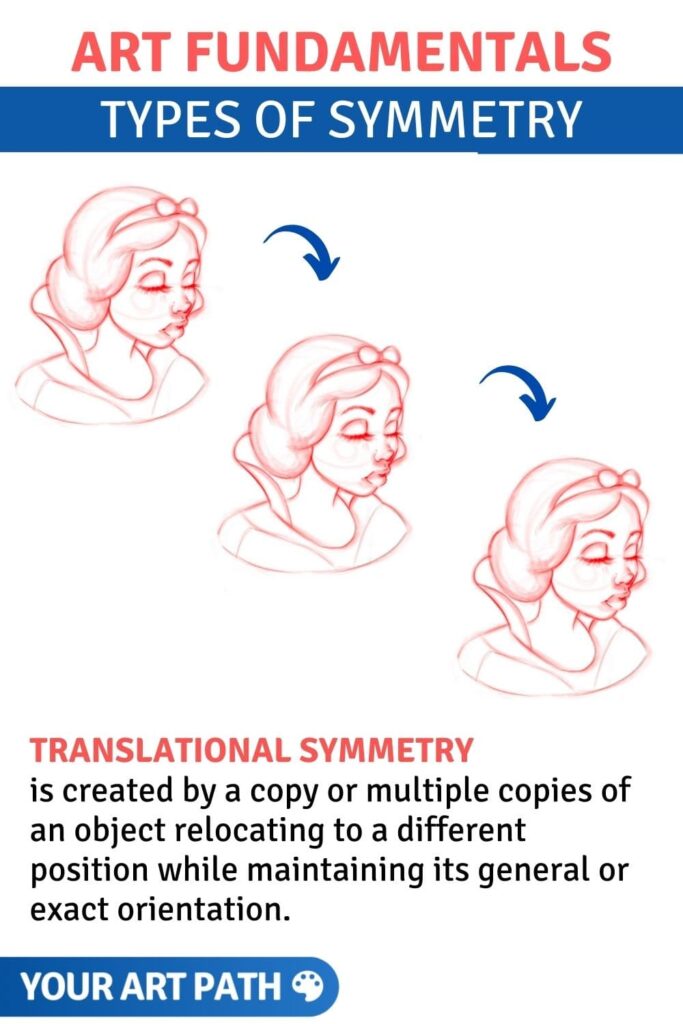
#3. Translational Symmetry
Translational symmetry is created by a copy or multiple copies of an object relocating to a different position while maintaining its general or exact orientation. The intervals between the copies don’t have to be equal or rhythmical to create translational symmetry; they only need to be proportional.
In other words, translational symmetry is when a movement or a slide happens to an object through a specified distance, but no reflection or rotation is involved. The object itself, its size, angles, and shape won’t change in any way, just the location. Like in the game of checkers – up or down, left or right, or any desired combination of these directions.
Artists use this type of symmetry to create patterns, like tiles and other repeated visual elements. Just like radial symmetry, artists can strategically use this one to create a sense of motion (like the moving effect in comic books).
Translational symmetry example:
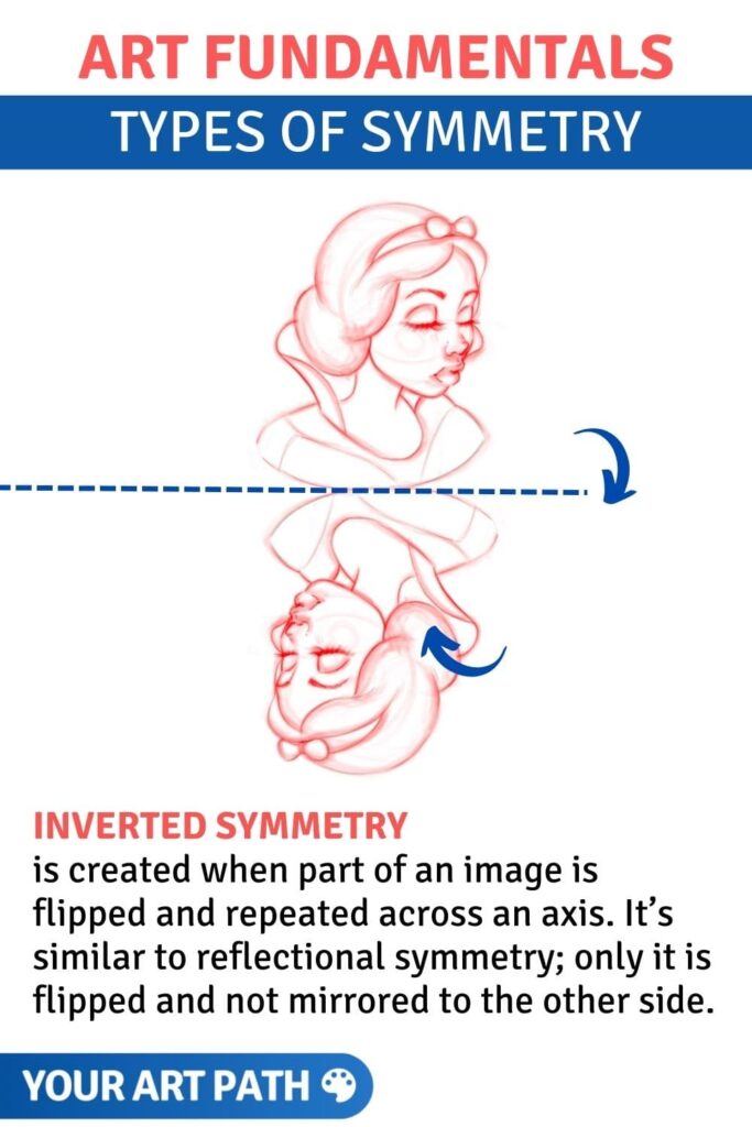
#4. Inverted Symmetry
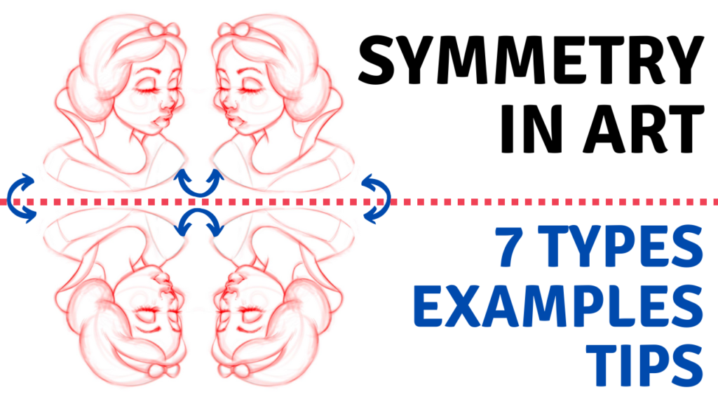
Inverted symmetry is created when part of an image is flipped and repeated across an axis. It’s similar to reflectional symmetry; only it is flipped and not mirrored to the other side.
This type of symmetry doesn’t work well with most subjects unless they are abstract or fulfill a specific design need. It’s most often used in playing cards and while building unique patterns.
Inverted symmetry example:
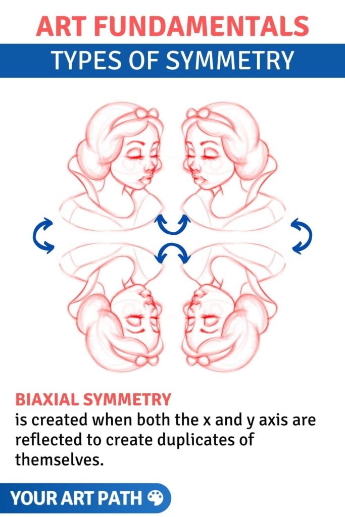
#5. Biaxial Symmetry
Biaxial symmetry is created when both the x and y axis are reflected to create duplicates of themselves. These are symmetrical designs on the top, bottom, left and right (horizontal and vertical axis).
This design is often seen in combination with radial symmetry in certain mandalas (learn to draw them), snowflakes, patterns and building designs.
If you want to test it for yourself, fold a piece of napkin in 4 and dip it into a few different colors of water. When you unfold the napkin, you will see biaxial symmetry.
Biaxial symmetry example:
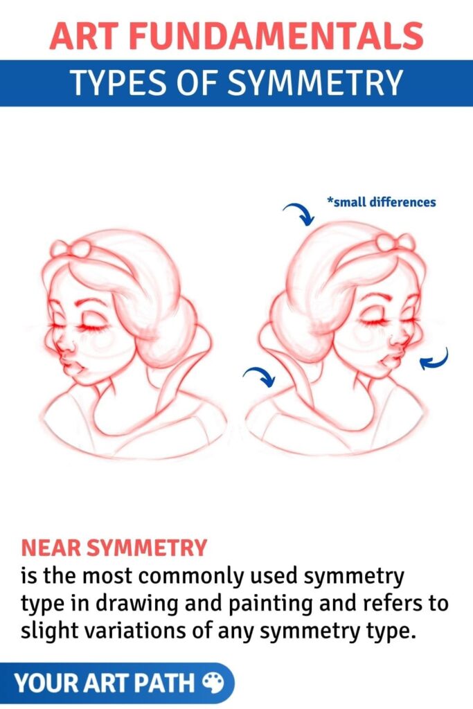
#6. Near Symmetry
Near symmetry is the most commonly used symmetry type in drawing and painting and refers to slight variations of any symmetry type.
Think of it as any of the earlier types of symmetry we discussed, but with slight imperfections.
When drawing portraits or character design sheets, you use near symmetry most of the time, without even realizing it. Whenever you try to draw anything symmetrical using your own judgement, you rely on near symmetry since you are satisfied when it looks close enough and not with mathematical precision.
Near symmetry example:
#7. Asymmetry
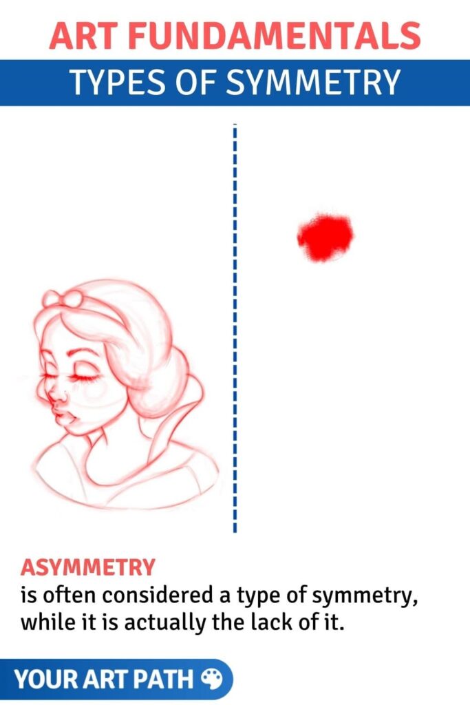
Asymmetry is often considered a type of symmetry, while it is actually the lack of it. We can find asymmetry in many natural objects, like trees, cloud shapes, natural water bodies, etc.
Artists can use an asymmetrical design to represent a break of pattern, imbalance or to create a feeling of disorder and attract attention to a certain point. An asymmetrical object has more visual weight than symmetrical objects, so asymmetry can also be used for patterns, backgrounds, and anything else that is supposed to be visually passive.
An example of asymmetrical balance:
Examples Of Symmetry In Art
Let’s look at some examples of symmetry and how old-time master artists used it in their famous paintings.
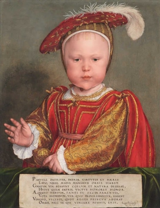
Hans Holbein the Younger, probably 1538
Edward VI as a Child was painted by Hans Holbein the Younger around 1538. It portrays a long-awaited young heir of the royal family, which makes the depicted child an important figure.
To highlight this and to make the child look as flawless and graceful as possible, the painter made his face look very symmetrical. People consider symmetrical faces beautiful, and this symmetry makes the child’s face appear unrealistically perfect, highlighting his beauty and serious facial expression.
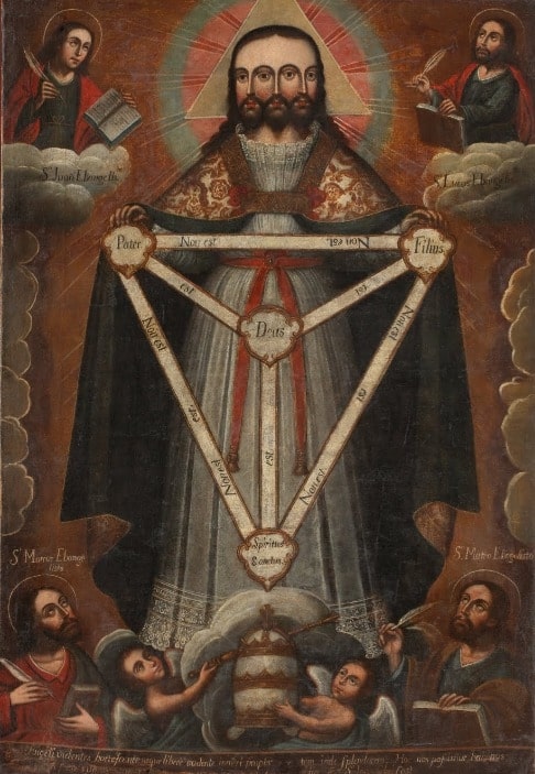
Anonymous Cusco School, ca. 1750 – ca. 1770
Trifacial Trinity by an unknown artist was created around 1750-1770. It’s a religious painting that uses bilateral symmetry to add a feeling of order and emphasize the central holy figure.
The central figure has three faces that are perfectly symmetrical in relation to the central axis, and the rest of the body is also balanced. Even the secondary small figures, meant to underline how important and mighty the central one is, are placed at the exact distances from the axis. They don’t look identical but are quite similar, and their locations feel symmetrical.
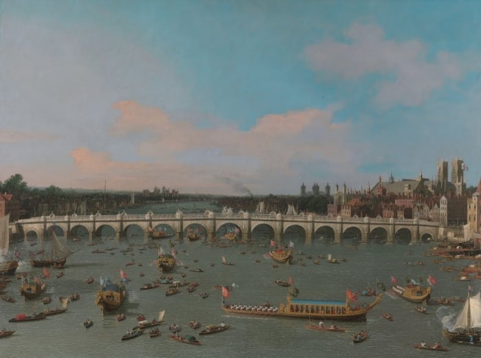
Canaletto,1747
Westminster Bridge, with the Lord Mayor’s Procession on the Thames. 1747, by Canaletto, has a long symmetrical bridge in its midground. It grabs even more attention than the boats and creates a sense of stability. It contrasts the boats with its size and static state, making them look like they’re in motion.
Pierre Patel, 1668
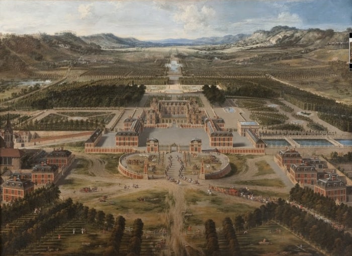
View of the palace and gardens of Versailles, seen from the Avenue de Paris, 1668, by Pierre Patel, is symmetrical because it depicts the symmetrical palace and gardens of Versailles. The painter deliberately chooses this angle and composition to show the beauty and magnificence of the legendary palace and its adjoining territory. As with most architectural objects, Versailles is symmetrical because it gives a sense of stability, solidity, and power.

Why Do Our Brains Find Symmetry Appealing?
Symmetry in art is known to create balance, harmony, and a sense of order. It creates an aesthetically pleasing effect on our minds, as humans are believed to seek symmetry.
But why is that?
Symmetry is one of the principles that create gestaltism – a theory about human behaviour that states that our brains want order and completeness in everything we encounter and look at. One of the theories is that it’s because we see symmetry everywhere in nature, and it feels natural, familiar, and beautiful. Our brains easily recognize symmetrical objects and images because they’re wired that way.
Another theory says that our ancestors sought out symmetry because it was associated with living beings. The bodies of other humans are symmetrical, and so are their predators and prey, so they should’ve looked out for symmetry. Choosing a partner, hunting for something to eat, or avoiding being killed – all of that required noticing symmetry and symmetrical bodies.
Another reason for our love for symmetry in art and life may be that our brains process information in a very particular way. The Western culture includes writing and reading from left to right, and the side of our brain responsible for the right hand (e.g. the left side) processes this information.
In 2011, scientists studied how the directionality of our writing and reading influences our depiction of depth in art (Academia Paper). They discovered that how we’ve been taught to write and read impacts what we find aesthetically pleasing later in life. Scientists also discovered that right-handed subjects prefer images with a “left bias,” and left-handed ones prefer the “right bias”.
The “left-side bias” means the following. A chimeric face is combined of the left (from the viewer’s perspective) side of a face and its mirror image, then shown to a study subject. Right-handed people considered it more similar to the original face image than a similar chimeric image made of the right side, while left-handed people thought vice versa.
Asymmetry in art can also be used effectively. We can find asymmetry appealing because it introduces some visual complexity and diversity to something organized and “boring”. It throws us off as something unexpected and captivates our eyes. However, that doesn’t apply to objects we are used to seeing as symmetrical, such as human bodies, animals, planets, etc.
Importance Of Symmetry in Painting Portraits
“Across many clever experimental designs, researchers have confirmed that we rate faces that are more symmetrical as more attractive than those with less symmetry” – PsychologyToday
It’s called “Evolutionary Advantage Theory”, and to explain it plainly, it is the idea that the more perfectly aligned your genes develop, the closer your face and body will be to perfect symmetry.
So, if the face is not perfectly symmetrical (and it never is), that indicates a sort of dysfunction.
That’s why we often see celebrities, models and influencers with very symmetrical faces being famous for their looks.
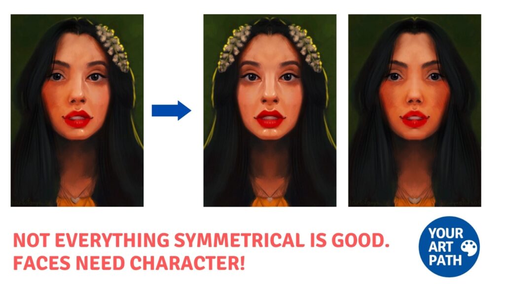
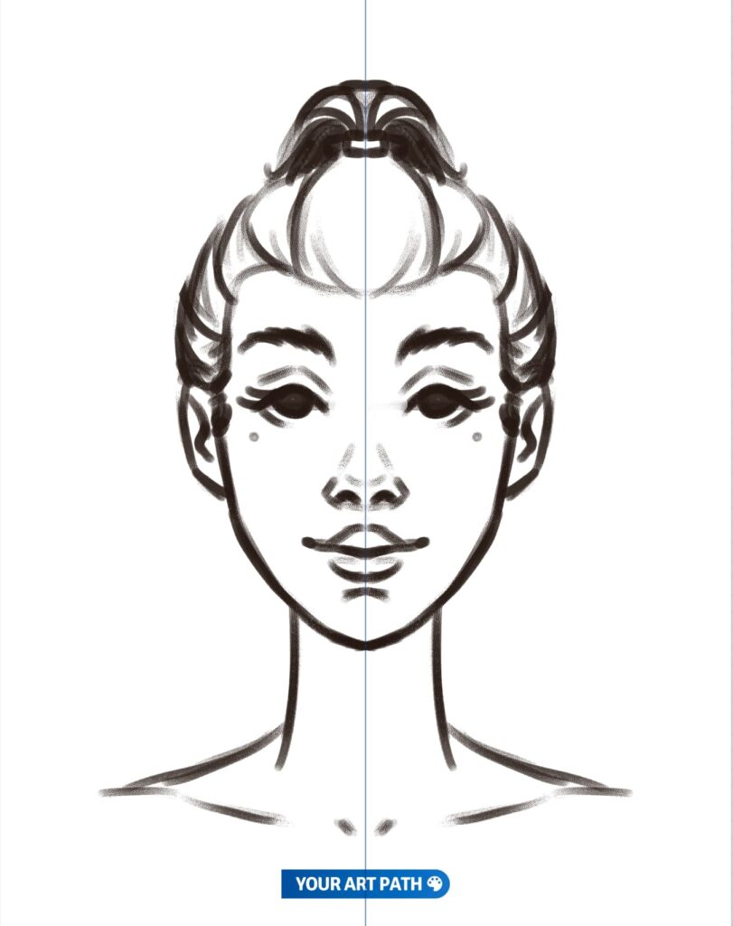
For some of them, we might even feel that their faces are perfectly symmetrical. In fact, they are slightly different still, and it’s called micro-asymmetry. Micro-asymmetry often can’t be spotted with a naked eye which is fantastic for us artists since we don’t have to worry about mathematically correct perfection when drawing objects by hand.
It is important to not forget about symmetry when painting people, which is why artists often “flip canvas”. In digital art, it means to flip the canvas you are working with, and with traditional art, it requires looking at your artwork’s reflection in a mirror.
This practice helps with drawing portraits as it allows you to spot the differences and dysfunctions of our drawings from a mirror image.
How To Incorporate Symmetry In Your Artworks
Now that you’ve learned what symmetry generally is and seen some stunning examples let’s find out how to create your art just as appealing and balanced! Here are a few tips on how to use symmetry in your own art project:
Devote some time to developing a composition.
You’ll need to decide on the type and the use of symmetry for your creative idea. Think about what you want to convey and what the scene you want to portray will look like. Symmetry, among other art elements, will help you achieve visual balance through the arrangement of elements.
Consider creating some thumbnail sketches like this first to try out different composition layouts and decide which one fits your idea the best. Decide on the placement of every object, their relations, and the focal point(s) before you begin the painting, or it might mess up the symmetry.
Consider the light source or sources of your composition and how they will affect the perception. Paying attention to the light in your work is a great way to achieve equal visual weight. Researchers say that most people prefer artwork lit from the left because most people are right-handed. An easy way of doing this is by adding light to the left cheek of the person you are painting. Of course, you don’t have to follow that information because every piece of art requires different approaches.
Practice reflection symmetry in your drawings with simple forms and random shapes, like hearts, curved lines, and geometrical figures. Draw the symmetry axis and one half of an object, then try to draw its reflection on the other side of the axis.
Practicing with grid lines to keep the proportions and the distances can help too. Grids can help you build a human face or a large composition with multiple objects.
Draw with symmetry in mind often! With more experience creating symmetrical and balanced compositions, you won’t need any grid lines or even drawn axes; you’ll just imagine them in your head.
Symmetry can be effectively used in art to convey certain things and cause a sense of order in a viewer. It may seem complicated to grasp at first, but humans are programmed to see symmetry and find it appealing, so you’ll learn to apply it and create symmetrical artworks quite easily.
Don’t hesitate. All you need after this article is a little practice, and your artwork will be as balanced as you desire.
7 Elements and 7 Principles of Art
You are currently learning about Symmetry – a part of the Variety Principle. There are, in total 7 elements of art and 7 principles of art.
The 7 Elements of Art are:
- Line (learn about 7 types of lines here)
- Color
- Form
- Shape
- Value
- Texture
- Space
The 7 Principles of Art are:
- Balance (learn about balance in art here)
- Contrast and Emphasis (learn about emphasis in art here)
- Movement and Rhythm
- Unity and Variety (learn about variety here, and 5 ways to use unity here)
- Harmony
- Pattern
- Proportions and Scale (learn about proportions and scale here)



One Response
Hey, Anna!
I have got to say, the knowledge of symmetry is very on point. I have never knew any other types of symmetry elements (i.e. bilateral, near), but I have heard of other symmetry elements (i.e. radial, assymetry).
Thank you for this knowledge, it makes me fell like I have something else to practice on composition. 👍🏾